
Adventure Buddies
A mobile application product design project
THE PROJECT: Design a travel app that helps solve issues while traveling
- When traveling in a group it is difficult to
- Plan effectively while ensuring everyone is able to do what they want
- Communicate Itineraries and activities
- Split shared expenses
GOALS AND OBJECTIVES:
Create a platform that aids multiple-party travel with planning, booking, splitting expenses, and communication.
MY ROLE: UX Researcher, UI designer (Individual Project)
TIMELINE: 4 Weeks
TOOLS: Adobe XD, PS, AI, Miro, Invision
My Process:

1. Empathize
Interview Plan:
To understand the range of behaviors when traveling with multiple parties over different age groups, 6 people were interviewed who range in age from early 20s to late 40s.
The interviews included the following topics:
- Travel type Business / Travel
- Who plans the trip
- Process of Planning
- Communication between parties
- How large bills are paid
- How reimbursements are made
- Obstacles
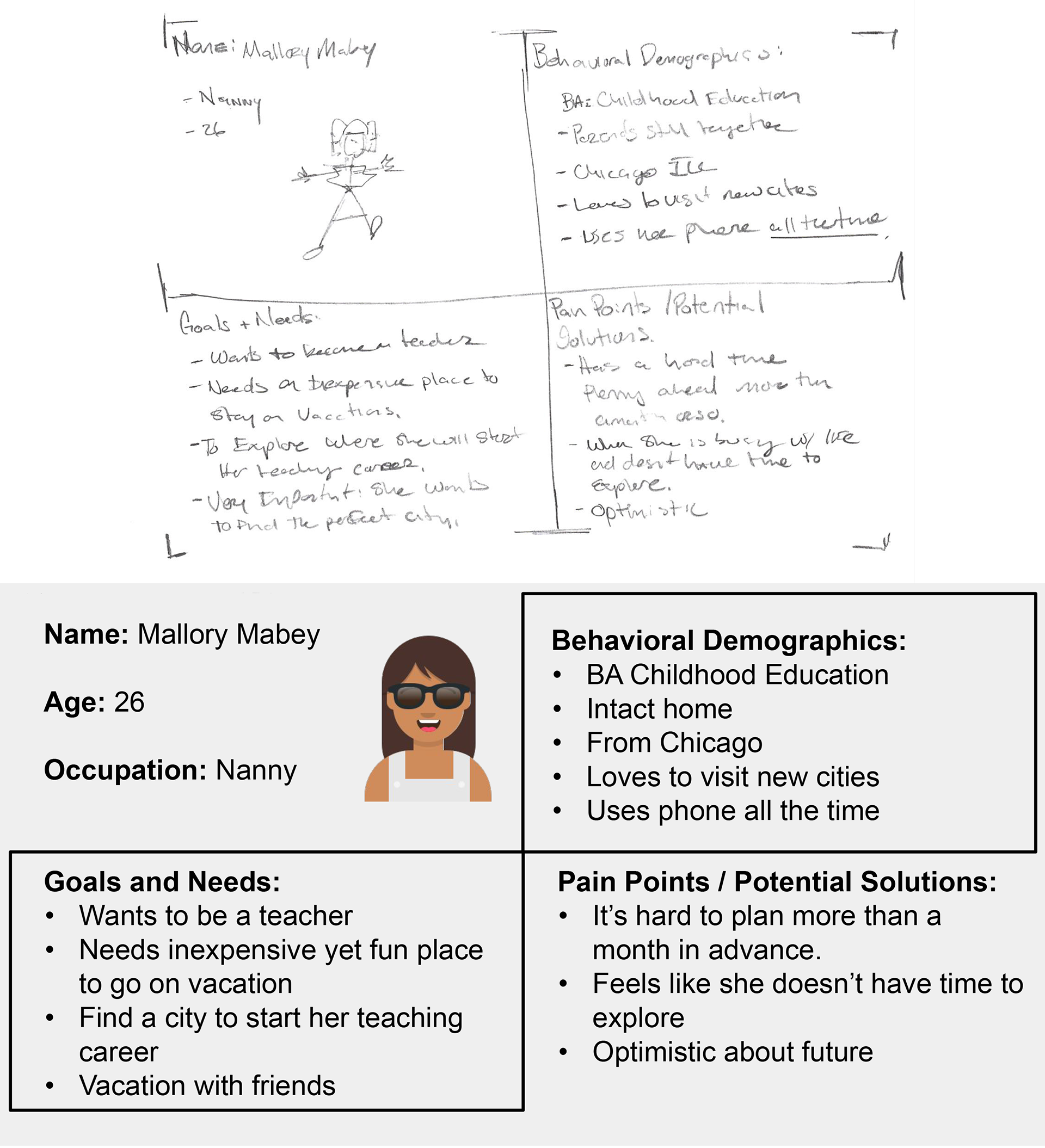
Proto Persona:
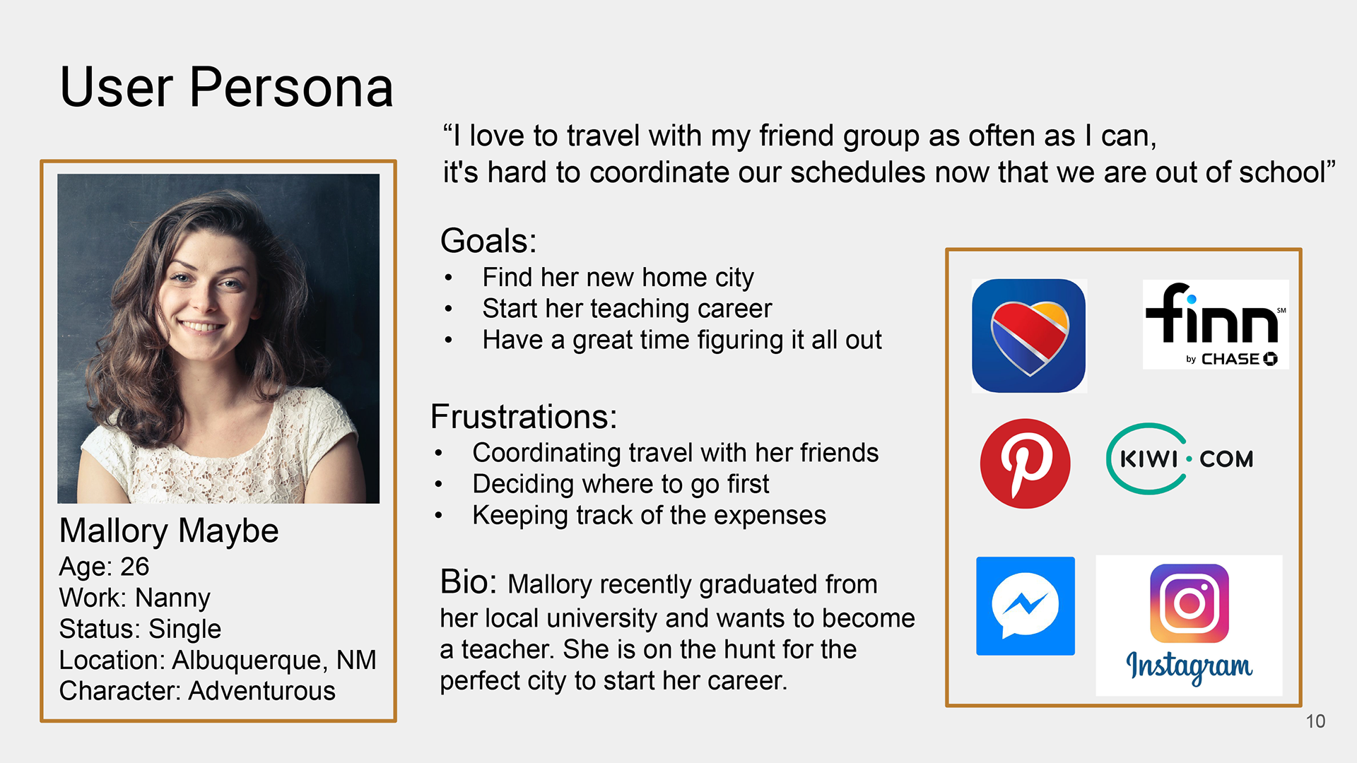
In order to have an idea of what items need to be addressed and solved in the app, I put together the proto persona of Mallory Mabey. She is a young professional who loves to travel with her friend group and is currently traveling to see if there is a place for her to start her new career.
Interview Results:
The initial interviews were very helpful in learning about the pain points when traveling in a group. One of the most interesting items was the difference in planning and paying by age group.
"With big groups usually using google docs to plan out the different places and things we do. And use Facebook chat or messenger” and “When someone offers to pay we will split it up and just Venmo them"
- Josh, Early 20s
“Whoever books it pays for the whole thing and then the other parties would provide payment. They usually pay with cash or check”
- Greg, Mid 40s
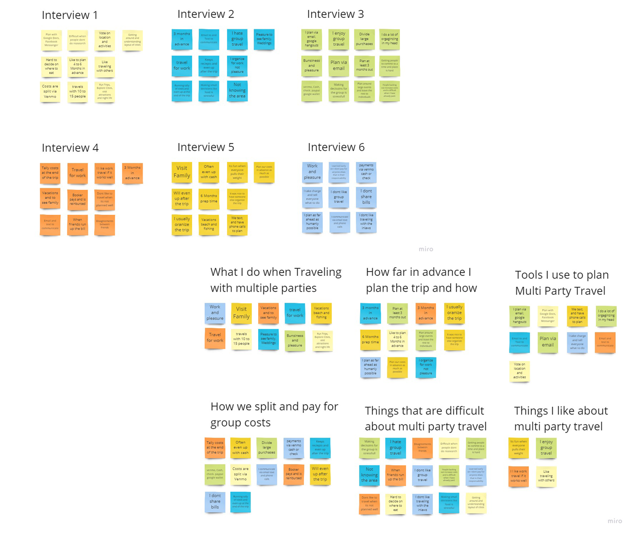
Affinity Diagram:
To better understand the results from the interviews I documented any significant data into a spreadsheet. Once that data was collected and organized by the interviewee I then transferred it onto a miro board.
I then organized this data into an Affinity Diagram to better understand the data at hand. It broke into 6 main categories.
- Things that are difficult about multi-party travel
- How far in advance I plan the trip and how
- How do we split and pay for group costs
- What I do when Traveling with multiple parties
- Tools I use to plan multi-party travel
- things I like about multi-party travel
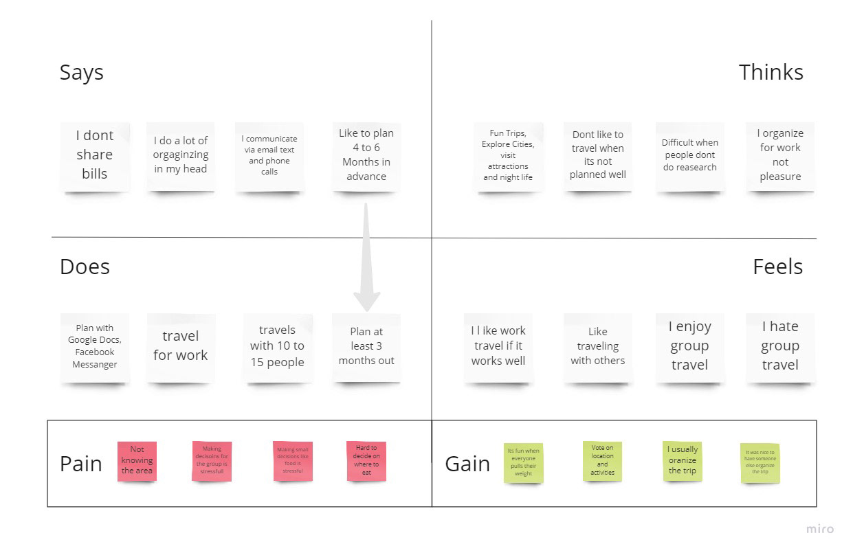
Empathy Map:
To better understand my pronto persona, the next step was to create an empathy map.
It allowed me to better understand how my users feel and react when using the app. It also allowed me to understand in a concrete way the variation in user thoughts actions and feelings.
This empathy map is a 6 section map:
- Says
- Thinks
- Does
- Feels
- Pain
- Gain
User Persona:
After analyzing the data and reviewing how people feel about group travel the user persona was updated and completed. Mallory Maybe, 26 is having a great time being a single nanny in Albuquerque NM.
User Insight:
POV 1 - Mallory needs help organizing and communicating with her travel companions because of the different ways her friends communicate and plan.
POV 2 - During the user surveys I discovered that while every group plans, the tools used to plan trips varies widely
Therefore, we believe that people struggle with planning communication and that we might be able to help if we build an application that serves as a central hub for planning and communication between travelers in multi party travels.
We might do this by implementing a central platform that will allow communication in many different ways. Doing this will allow our product to be used by many different age groups and technological minded individuals.
2. Define
Problem Statement:
Hypothesis:
We believe that creating a tool to help groups communicate, plan, schedule and split costs for people who travel in groups of more than 2 people and use modem day tools to plan and communicate. This will achieve a simplified process for planning, itineraries and cost splitting for all parties to see and compare information.
Problem Statement:
Adventure Buddies was designed to aid you and your friends in planning, scheduling and cost analysis for your trip. We have observed that current services aren't meeting the current needs allowing you to view, track or share your information with your friends and travel buddies. How might we create a platform of planning activities and communication so that our customers are successful based on every customer using at least one of the offered services?
Feature Prioritization Matrix:
I started with the I like, wish, what if exercise is one where you have just a few time boxed moments to create a list of items your product may include. They are of course I like, I wish and what if. Once these items have been expressed on a sticky note you then have the opportunity to card sort with participants. In this case the participants selected a category for each item, giving me a starting point for all my information.
The feature prioritization matrix is a great quick way to better understand and visualize what items need to be expedited. This activity was key in starting my sketches and wire frames.

Value Proposition:
Adventure Buddies is developing group planning tools to help group travelers to solve planning and cost sharing when traveling in a group. We’re better because we help you communicate in various ways with your traveling companions. We’re believable because planning with us is easy and fun.

Storyboard:
1. Mallory want to visit a new city with friends
2. She uses Adventure Buddies to invite a few friends
3. Three friends accepted the invite
4. The four of them submit ideas for the trip, then vote on what to do
5. They make their plans share scheduling and start tracking costs
6. They have a great stress great weekend exploring and doing all the things they wanted

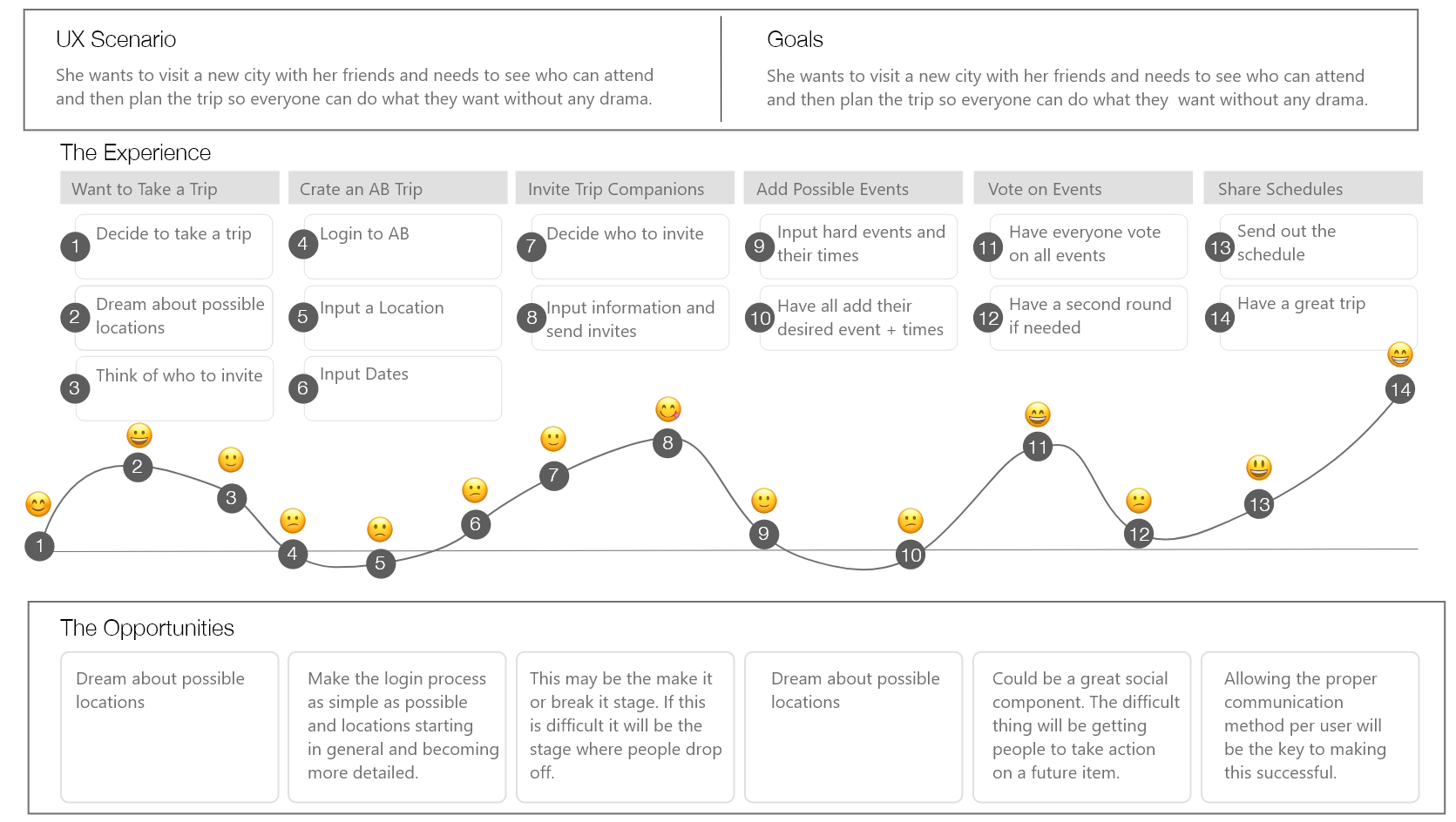
User Journey Map:
UX Scenario: Mallory wants to visit a new city with her friends and needs to see who can attend and then plan the trip so everyone can do what they want without any drama
Goal: Find her new home city, Start her teaching career
and Have a great time figuring it all out
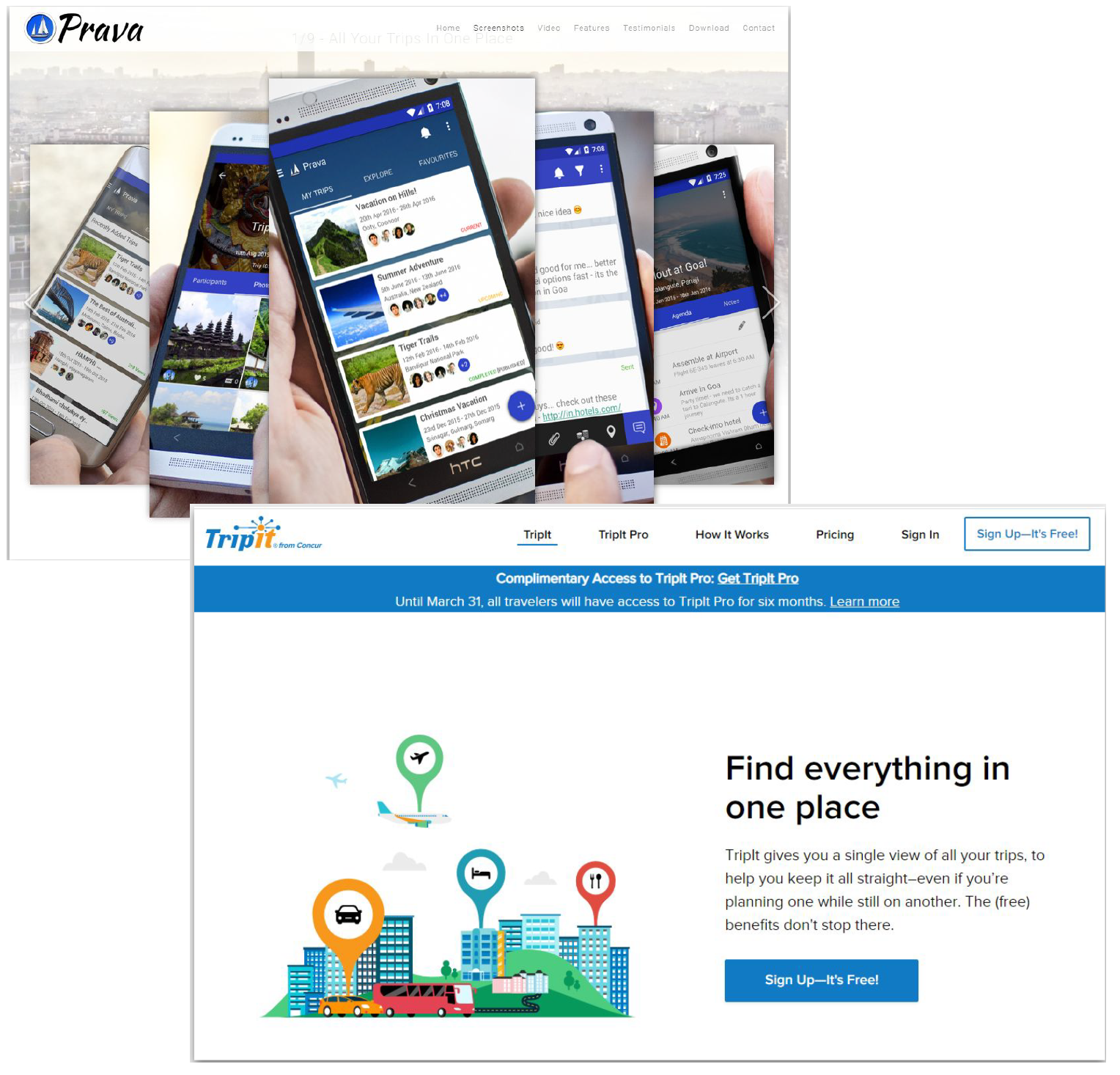
Competitor Anaysis:
Prava: Features include: Splitting Costs, Seeing my Itinerary, seeing my friends Itinerary, Being able to share photos, Communication between friends.
TripIt: Features include: Splitting Costs, Seeing Itinerary, seeing my friends Itinerary, Being able to share photos, Communication between friends
3. Ideate
User Flow:
To make an initial go at creating a user flow and information architecture layout. Starting at the first landing page and ending in what some of the trip items may look like, this user flow would end up being my road map for the initial wireframes and concepts.

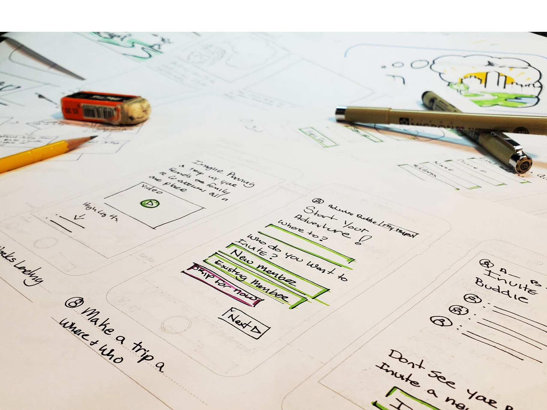
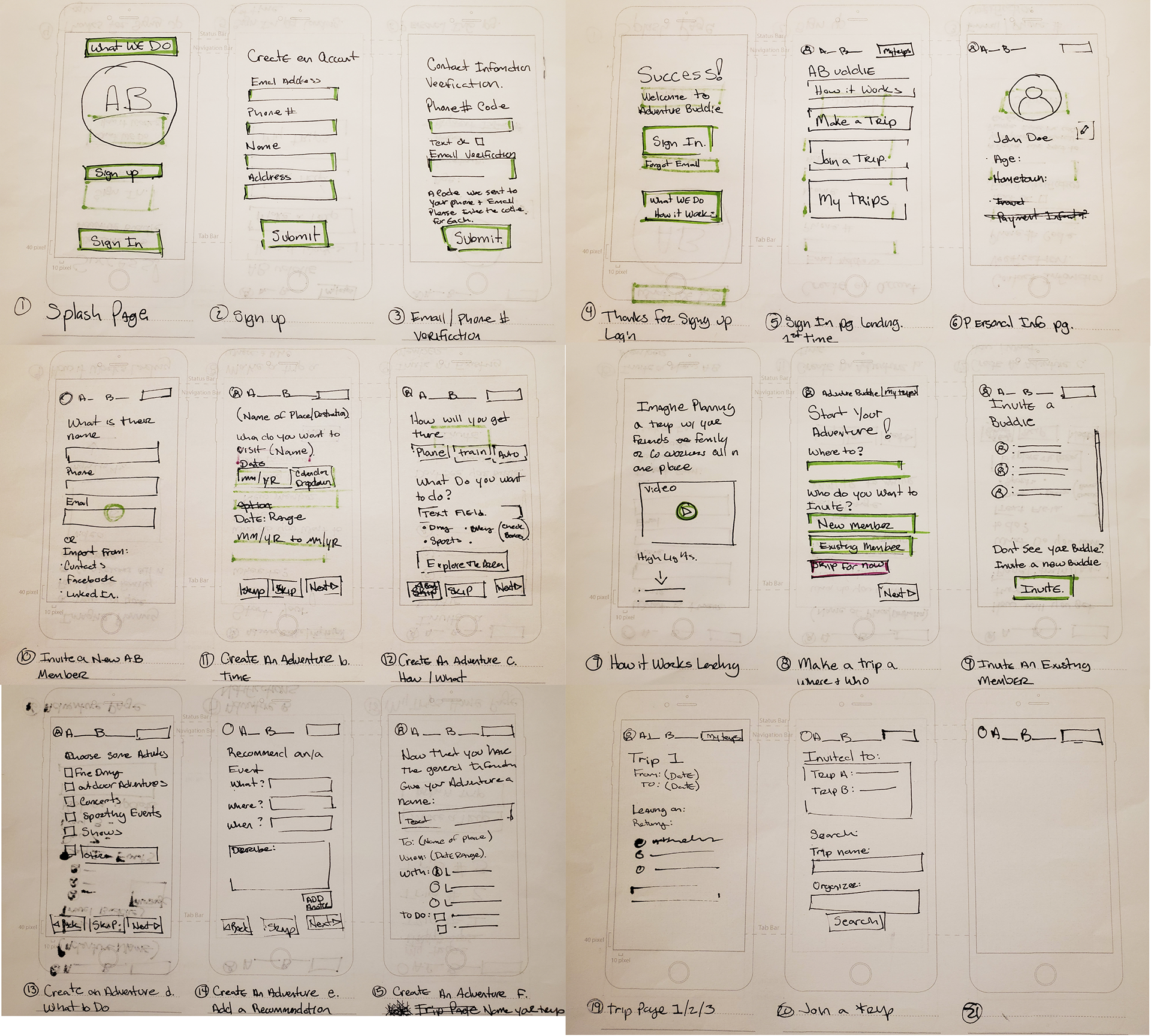
Sketching:
Using the user flow as a base I began to create quick page sketches and concepts for the main pages in the application.
Concepts Explored:
- Splash
- Sign Up
- Sign In
- Personal Info
- How It Works
- Create an Adventure
- Home Page
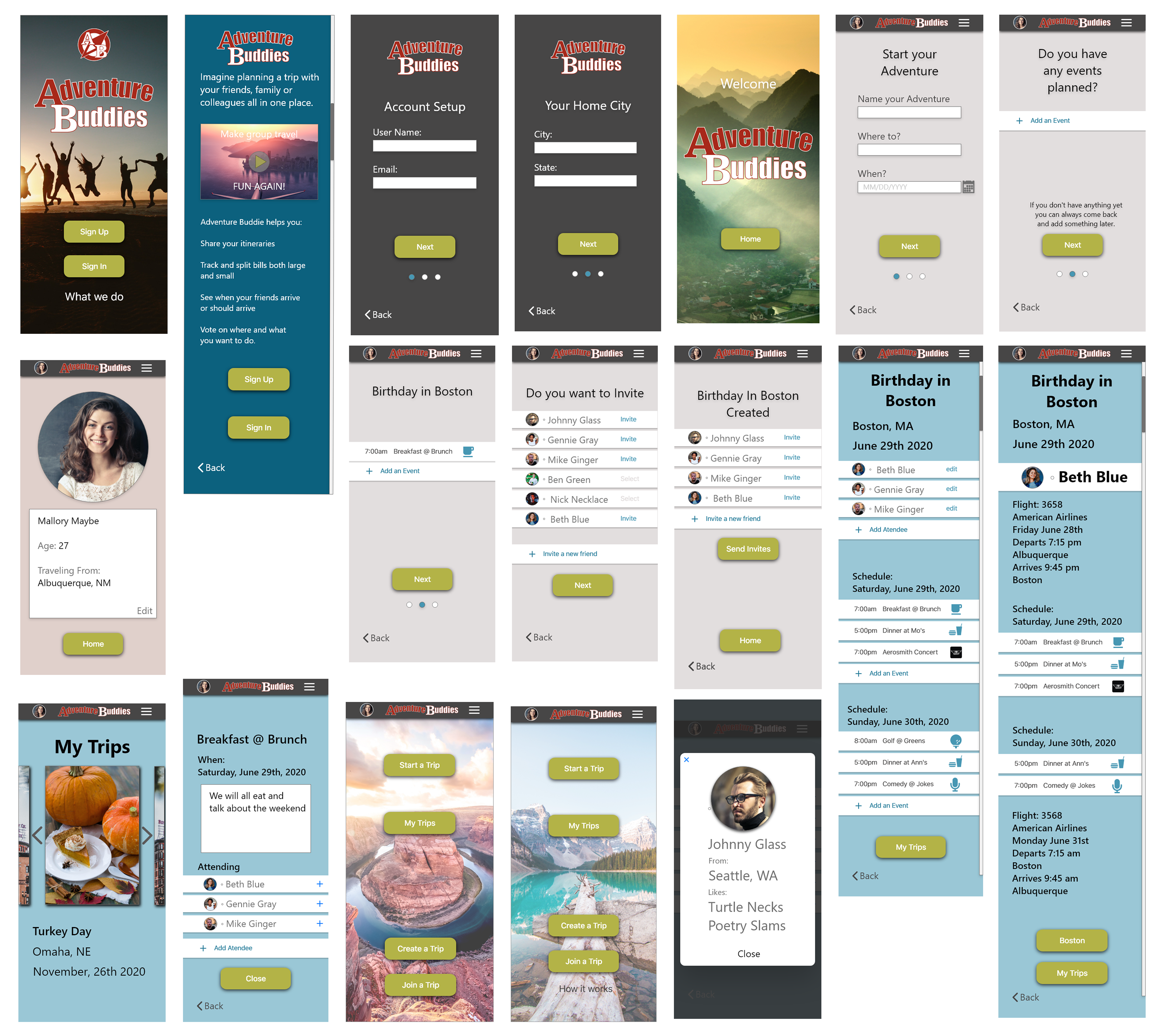
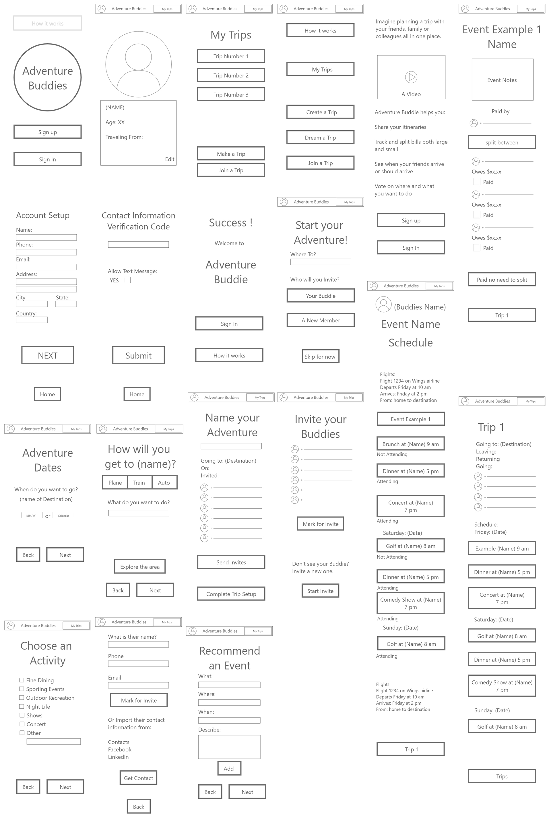
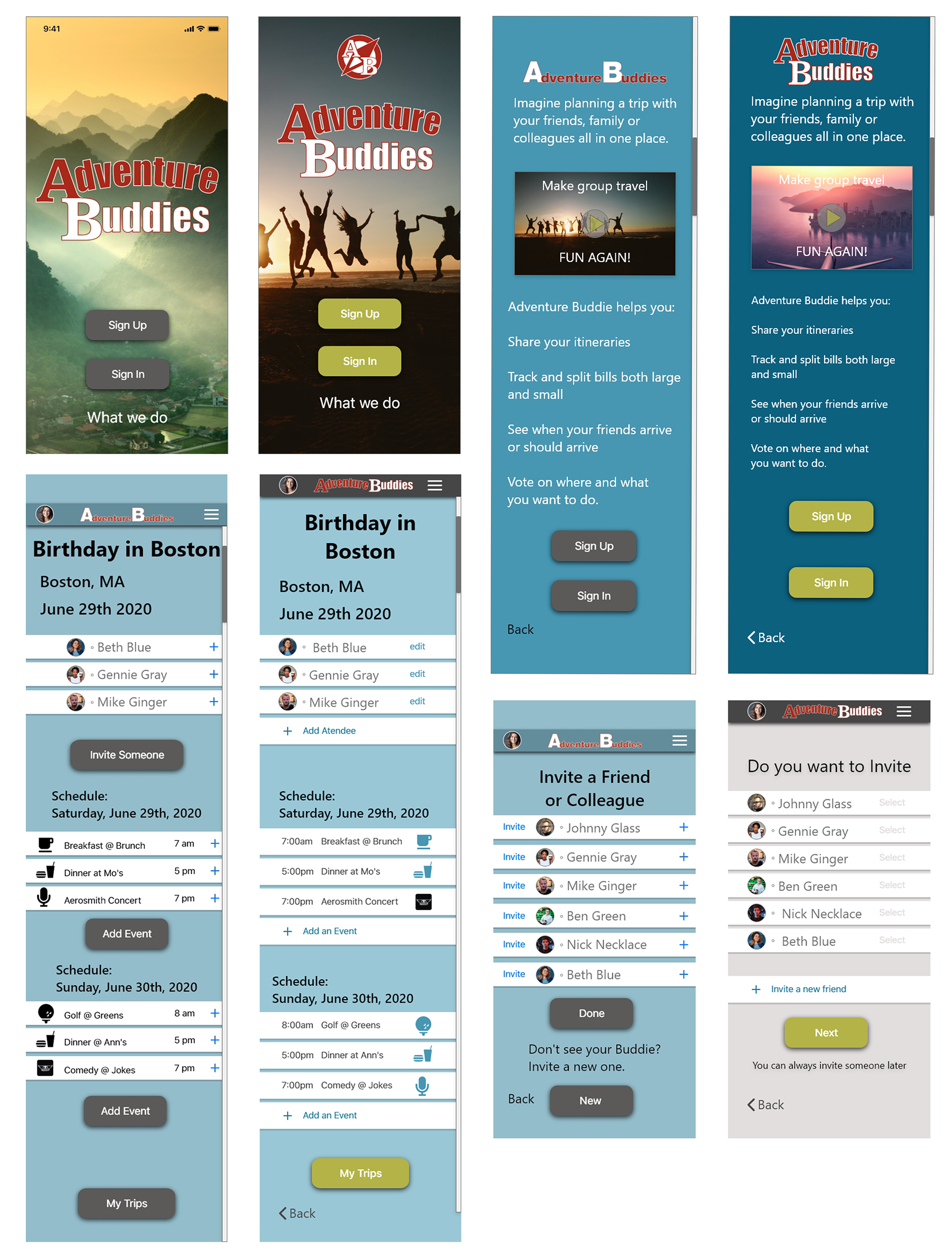
Wireframes:
Using Adobe XD I created initial low-fidelity wireframes to help flush out a few ideas. when building out processes and starting to experience the length of the initial design it helps you imagine how it may feel. this was a great exercise in creating a sign-up and create an event.
Once they were built out I created a second run in a slightly higher fidelity prototype that I could use for testing.
4. Prototype
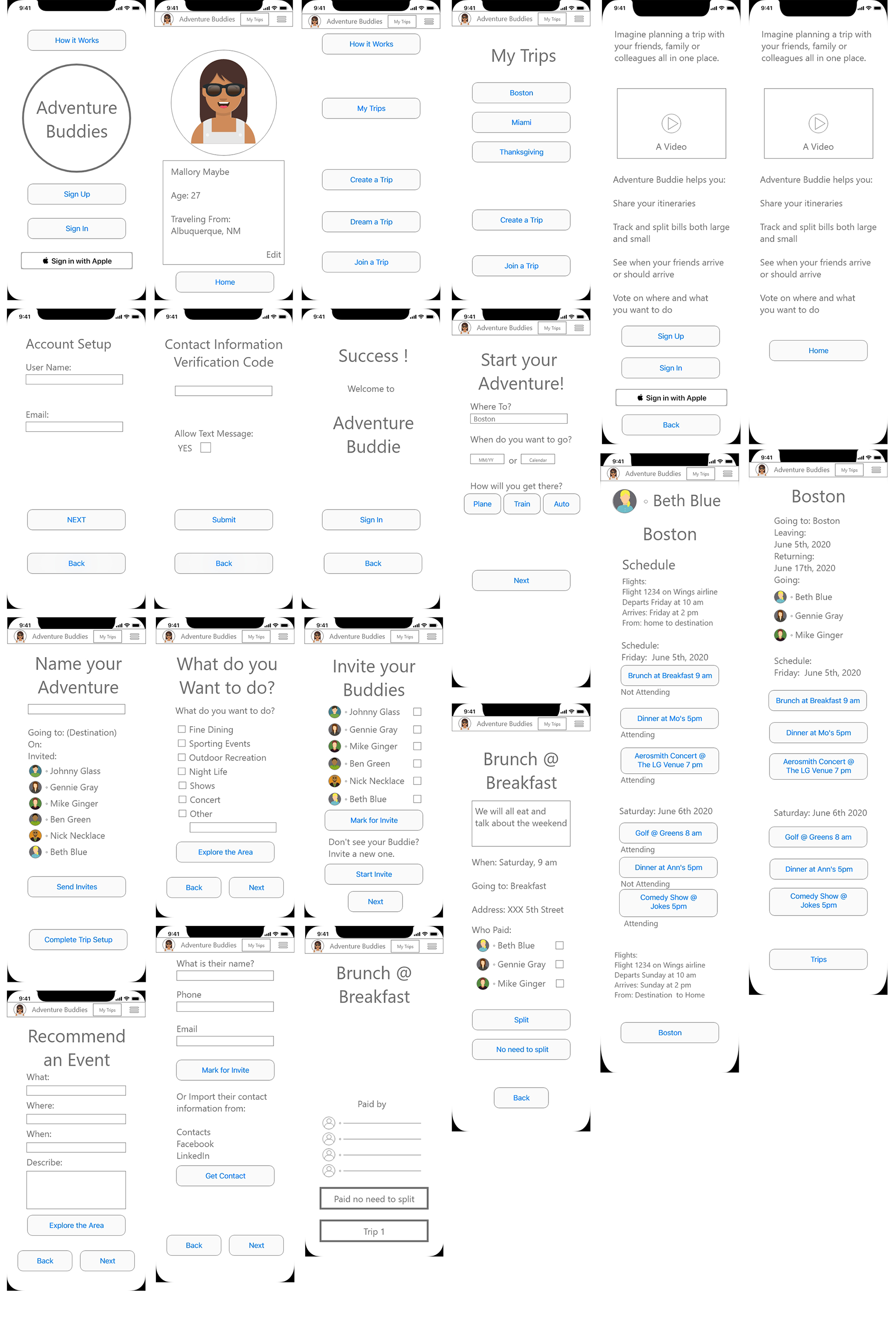
Prototype:
The first clickable prototype for this project was a wireframe prototype. After building the first wireframe I reduced some pages and created an easier interface for testing.
5. Test
User Tests:
It was time to start testing. I took the prototype created and tested three different scenarios with 6 participants. Due to pandemic conditions, one of my only ways to test was via zoom or other online communications. While it was a learning curve it also allowed me to record both their face and actions. Reviewing all the recordings gave me additional insight into how they interacted and felt about the prototype.
User Tasks:
- Learn About Adventure Buddies
- Sign Up
- Create a Trip
- Invite a Friend
- Find a Friends Itinerary
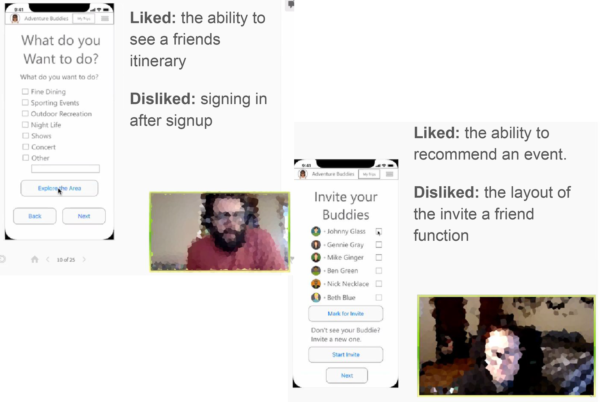
Key Learning From User Tests:
Simplicity is Difficult:
As tempting as it may be to have a screen with multiple tasks it may be better to keep one task per screen so the user doesn't have to ask any questions.
Steps are essential to the story:
If any step of the process is not clear you will lose the user.
Iterations Based on User Testing:
Simplified User flows:
By moving a decision point from the start of a task to the end of a task I was able to remove a parallel task reducing the complexity of that task by 50%
Clarified Copy:
Some copy items that make sense to the designer did not have any context for the user.
Updated Feature Layout:
The My Trips page was featureless and lacked any interest. It was updated to include a carousel swipe feature that allows the user to view all their trips without scrolling.

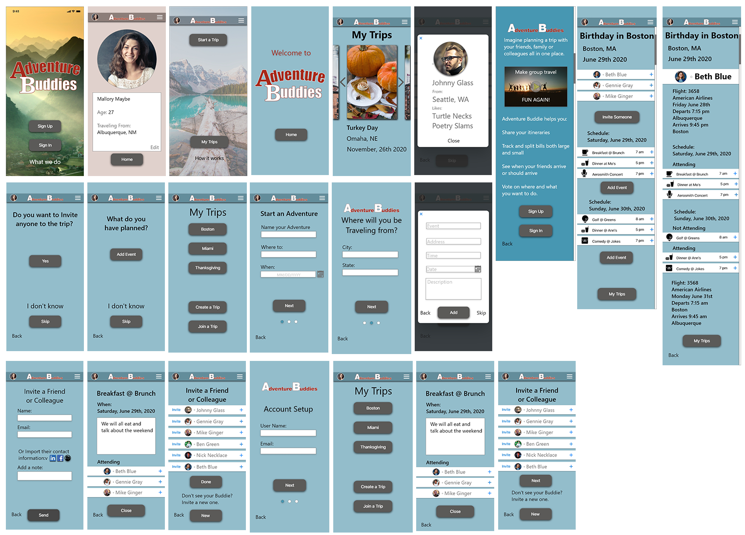
High Fidelity Prototype:
With guidance based on the user testing a very basic brand and color scheme was created and applied to the wireframes. when applying the brand many items become more sophisticated and were cleaned up from their rough state. Many items were updated per the user feedback.
Guerilla Testing:
Objective:
To identify navigation issues in the process that may need refinement.
Target Users:
Targeted users are professionals who travel with more than one party for either work or pleasure.
Participants: 4
Tasks Tested:
- Sign in with no complications
- User creates a trip to Boston
- Find the itinerary for the Boston trip
- Find Travel companion Beth Blues itinerary
Iterations Based on User Testing and Reviews:
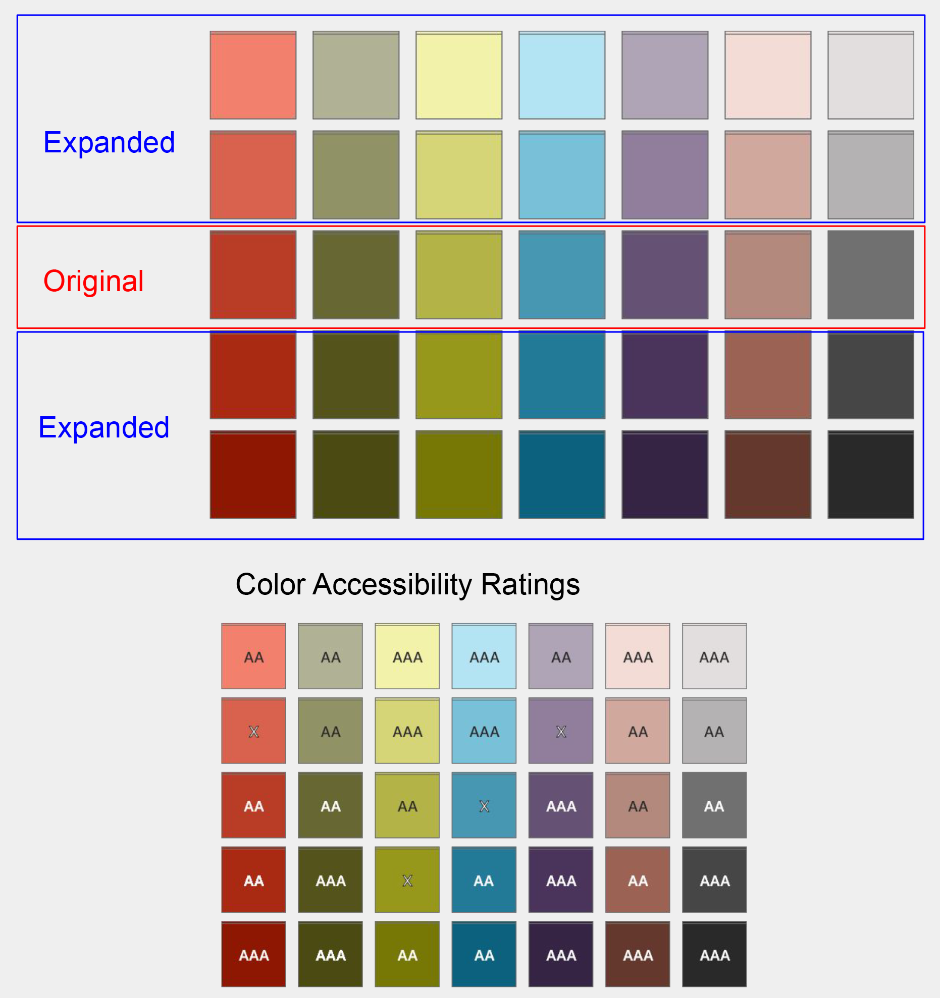
Color Pallet:
Increase the contrast with a minimum AA contrast and readability rating.
Column Spacing:
Update spacing and width designs to fit within a column layout for better RWD.
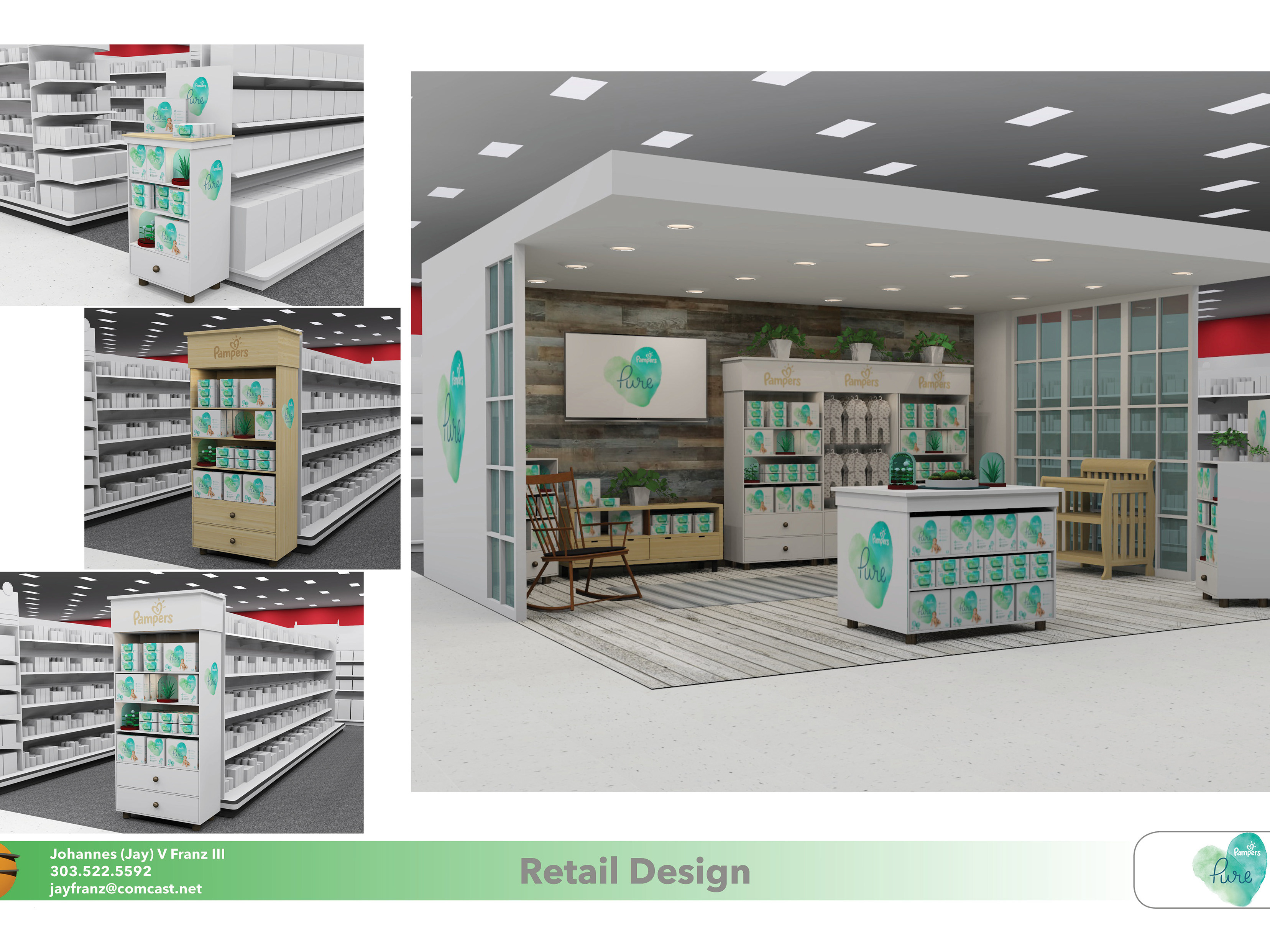
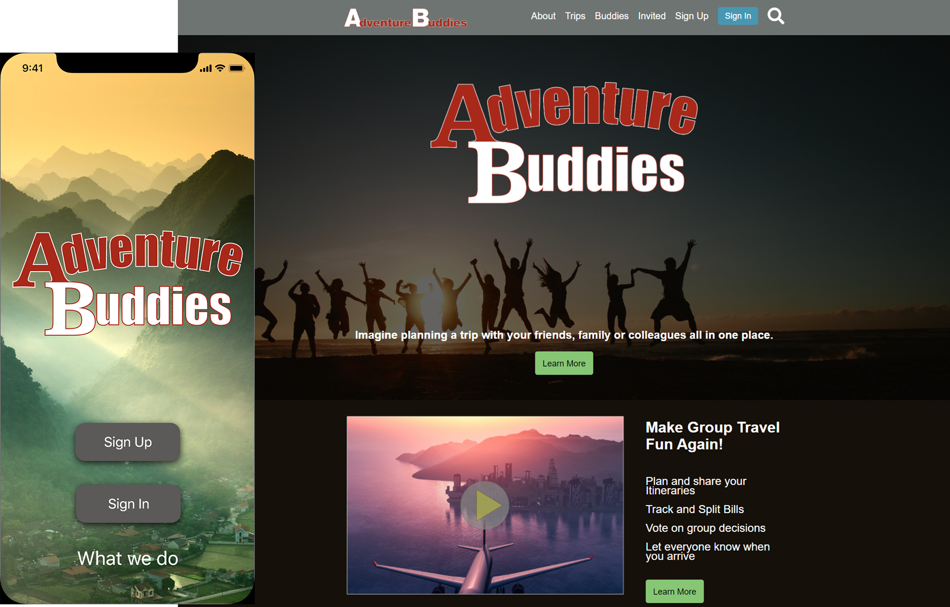
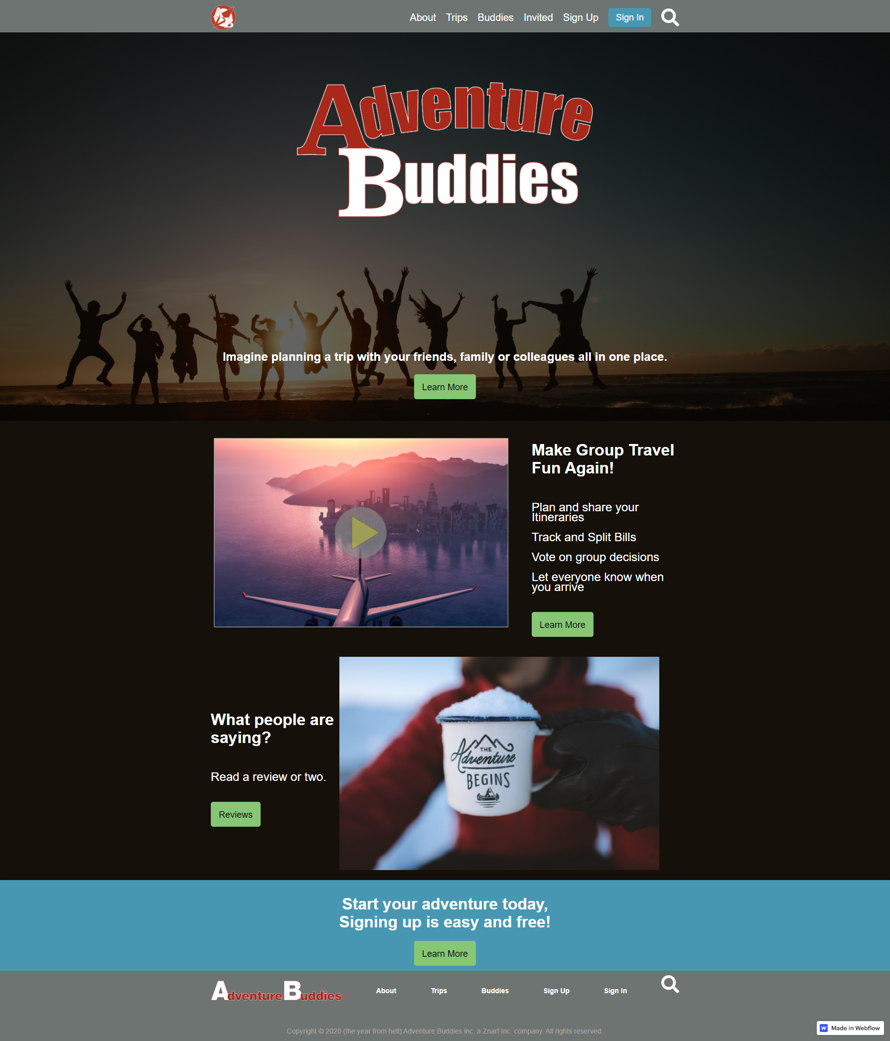
Website:
I would like to create a website. Due to time constraints, I will keep it to the home page.
Logo:
Need to design a logo that fits in an icon size
Expanded Color Pallet:
I expand the color pallet to meet minimum AA compliance.
Web Presence:
I wanted to expand the presence of the application to the web. Due to time constraints, I kept this piece to the home page.
Latest Prototype: