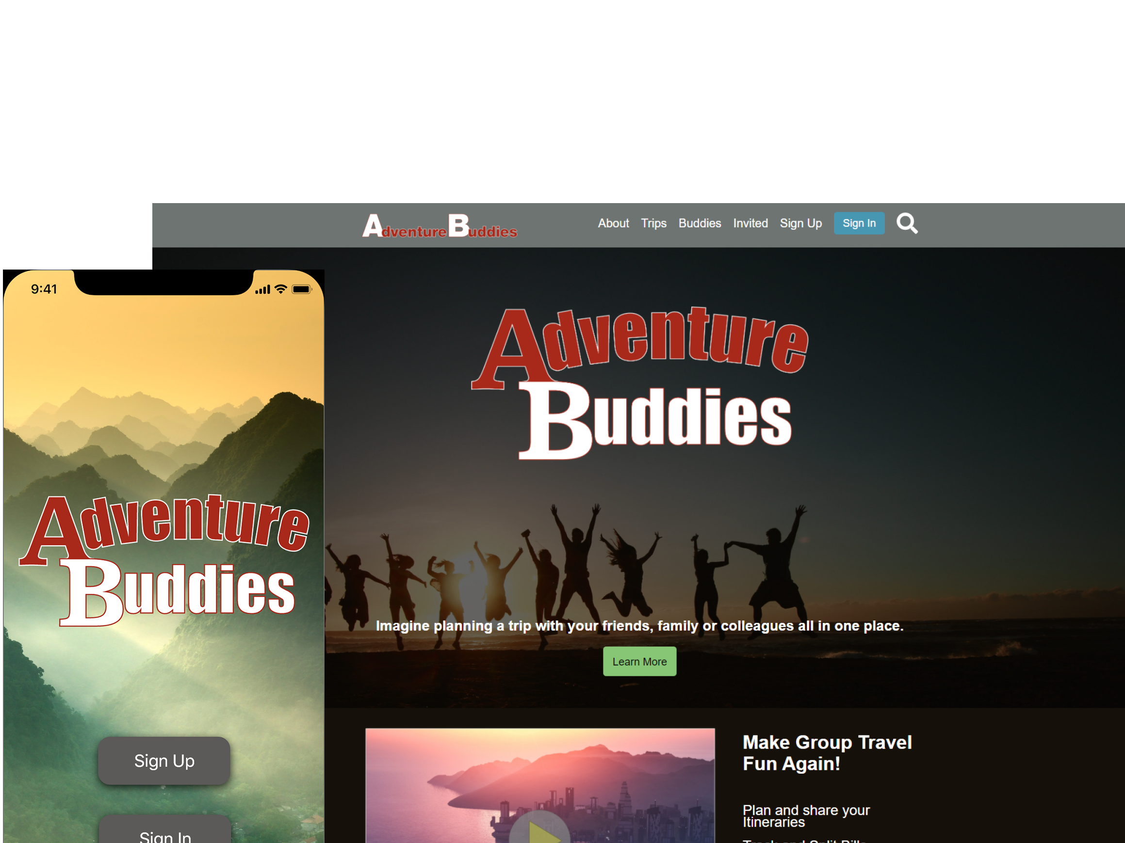

CASA of the 9th District
A mobile first UX/UI site redesign group project.
The Problem: CASA of the Ninth needs to increase the acquisition rate of potential volunteers
The Solution: Redesign their site following the potential user flows, making information more accessible and readily available.
My Role: Lead UX / UI Designer, group project
Tools: Adobe XD, PS, AI, Miro, Trello, Optimal Workshop
Timeline: 3 Weeks
My Process
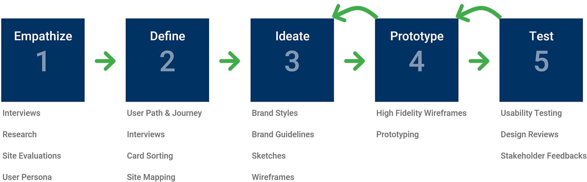
1. Empathize
What is CASA of the 9th?
CASA (Court Appointed Special Advocates) of the Ninth is a volunteer-based nonprofit organization that trains and supervises volunteers to represent the best interests of our most vulnerable citizens – victims of child abuse, neglect, and severe domestic conflict.
The CASA Mission - “Our mission is to provide well-trained, court-appointed volunteer advocates to abused and neglected children in Colorado’s 9th Judicial District. The program’s vision is to support a safe, permanent, nurturing home for every child it serves.”

"The primary users of our current site are CASA Volunteers, prospective volunteers, general public, grantors, staff, clients"
- Jessica Owings, President
The Current Issues:
The CASA of the 9th site has several issues.
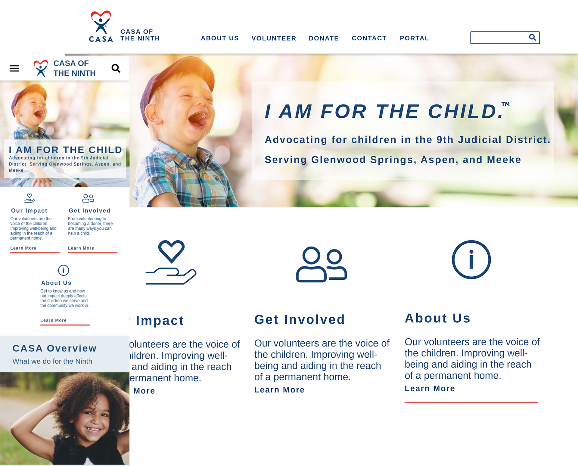
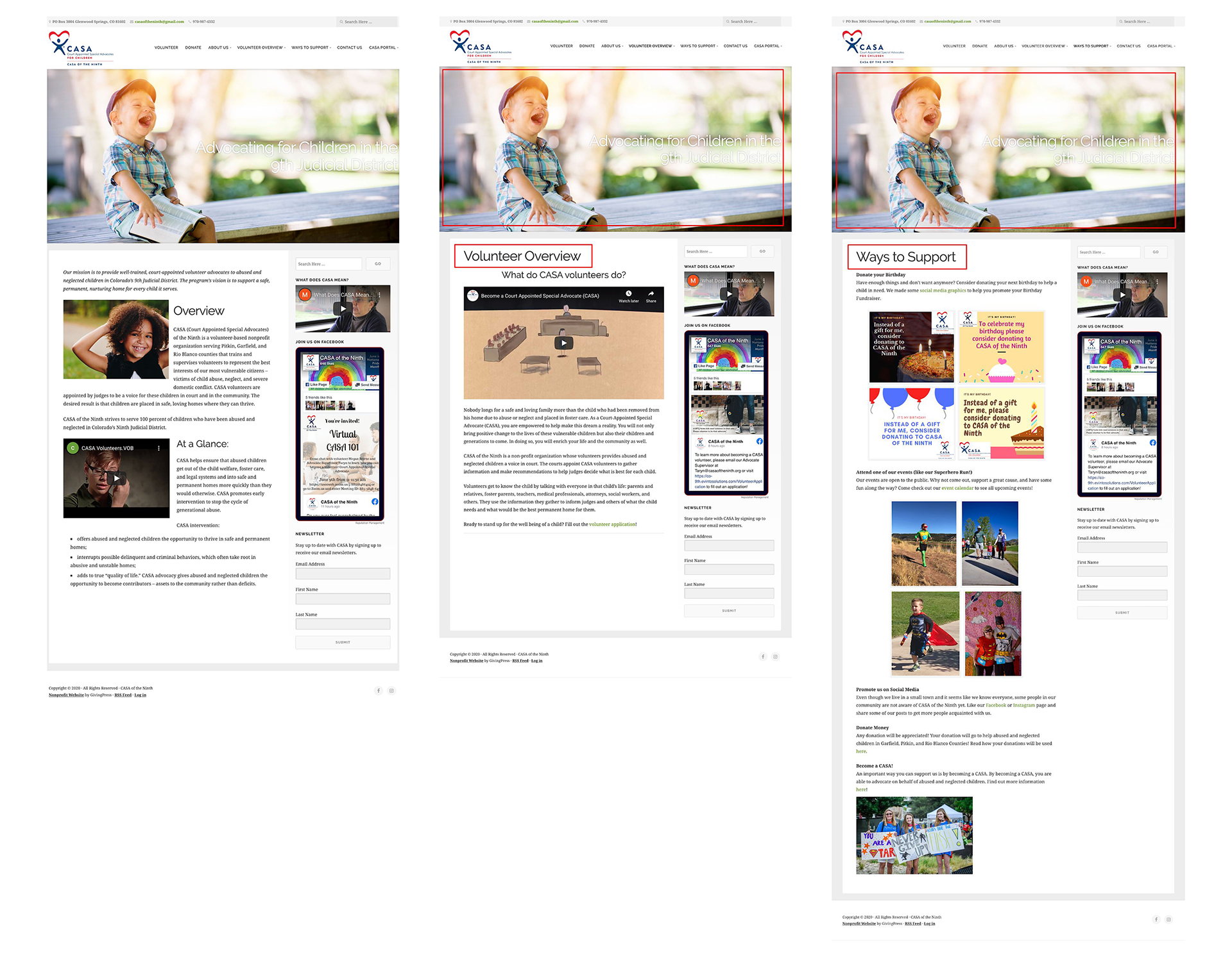
Same hero across multiple pages:
Most pages have the same hero. Without any change in the hero, it is almost impossible to tell when you have landed on a different page, making meaningful navigation nearly impossible.
Information Organization:
Page content does not have a meaningful path or logical structure. This creates confusion while navigating the site and searching for information.
Visual Layout and Information Chunking:
Each page has a different information layout that is often incomplete or even consistent per page.
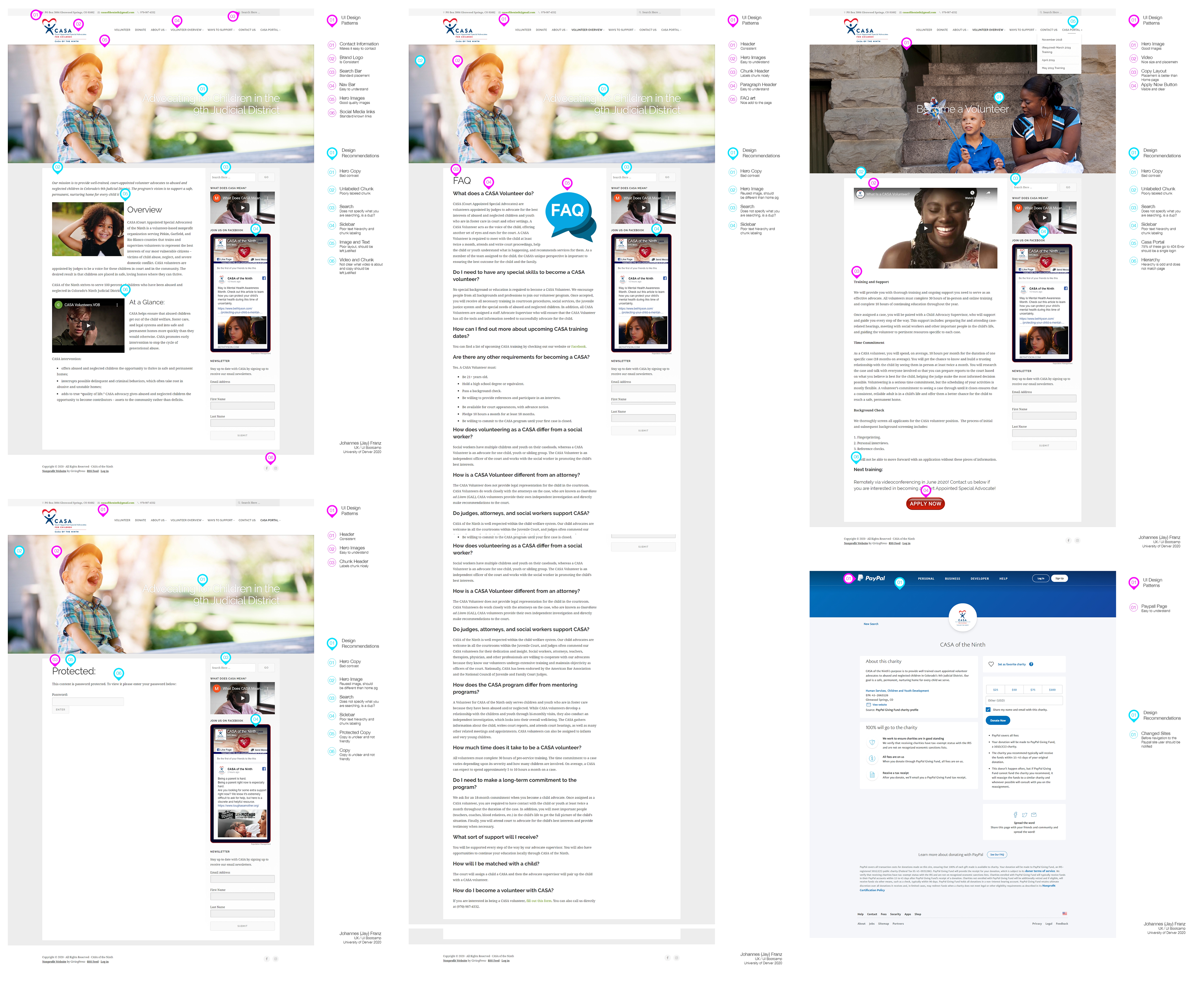
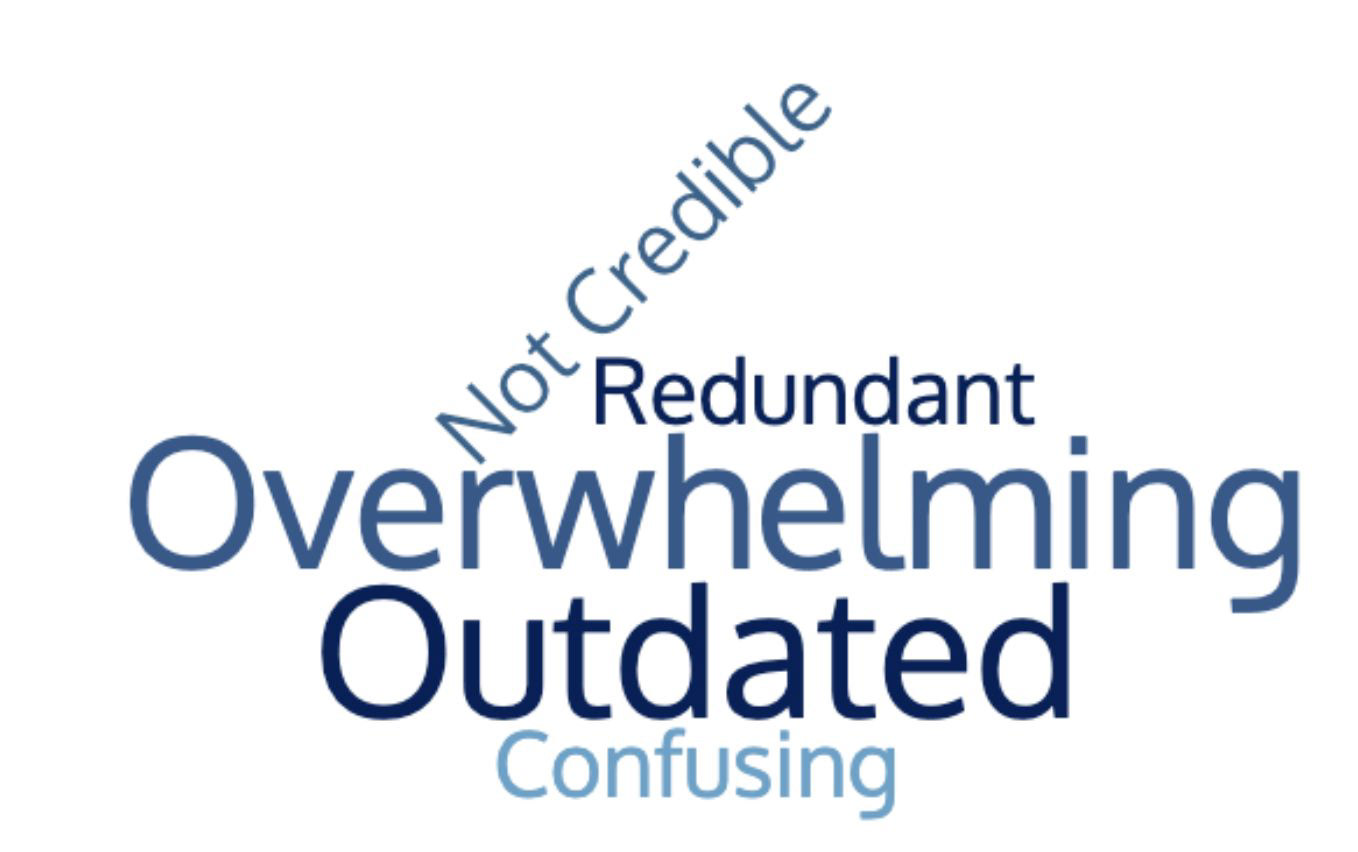
Heuristic Evaluation:
In an effort to better document the issues at hand and understand what a user may encounter, I conducted a Heuristic Evaluation. The application page became a focus almost immediately. It is off-brand and does not match anything on the site. This creates confusion by the user and lacks credibility with the brand. The site has issues with redundant information and out-of-date information that ends in error pages.
The positive aspects of the site include the rich information showcased on the site, and its branding seems to be positive and consistent.
Proposed Project Scope:
- Navigation
- Page consistency
- Information accessibility
- Redundancy
- Page Credibility
The content itself is rich and understandable
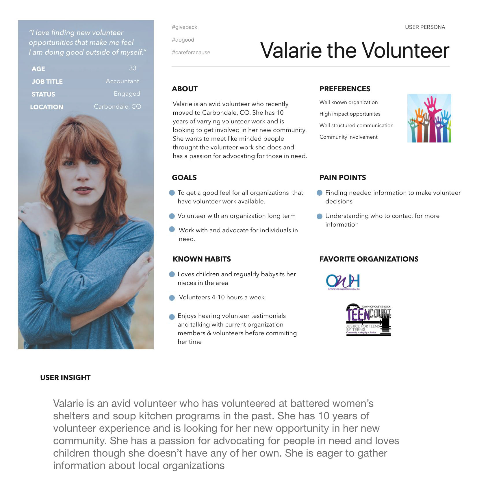
User Persona:
After closely examining the site, its issues, and learning how it is used a persona began to take shape. Valerie the Volunteer is new to the 9th district and looking to be involved in and support her new community.
Valerie the Volunteer:
- Looking for a volunteering opportunity in her new community
- Passion for advocating for people's needs
- Over ten years of volunteer experience
- Loves children
2. Define
Defining a User Path
After careful consideration, and discussion with the president of CASA of the 9th a user path was defined. It would allow visitors to learn about the organization and sign up to become a volunteer.

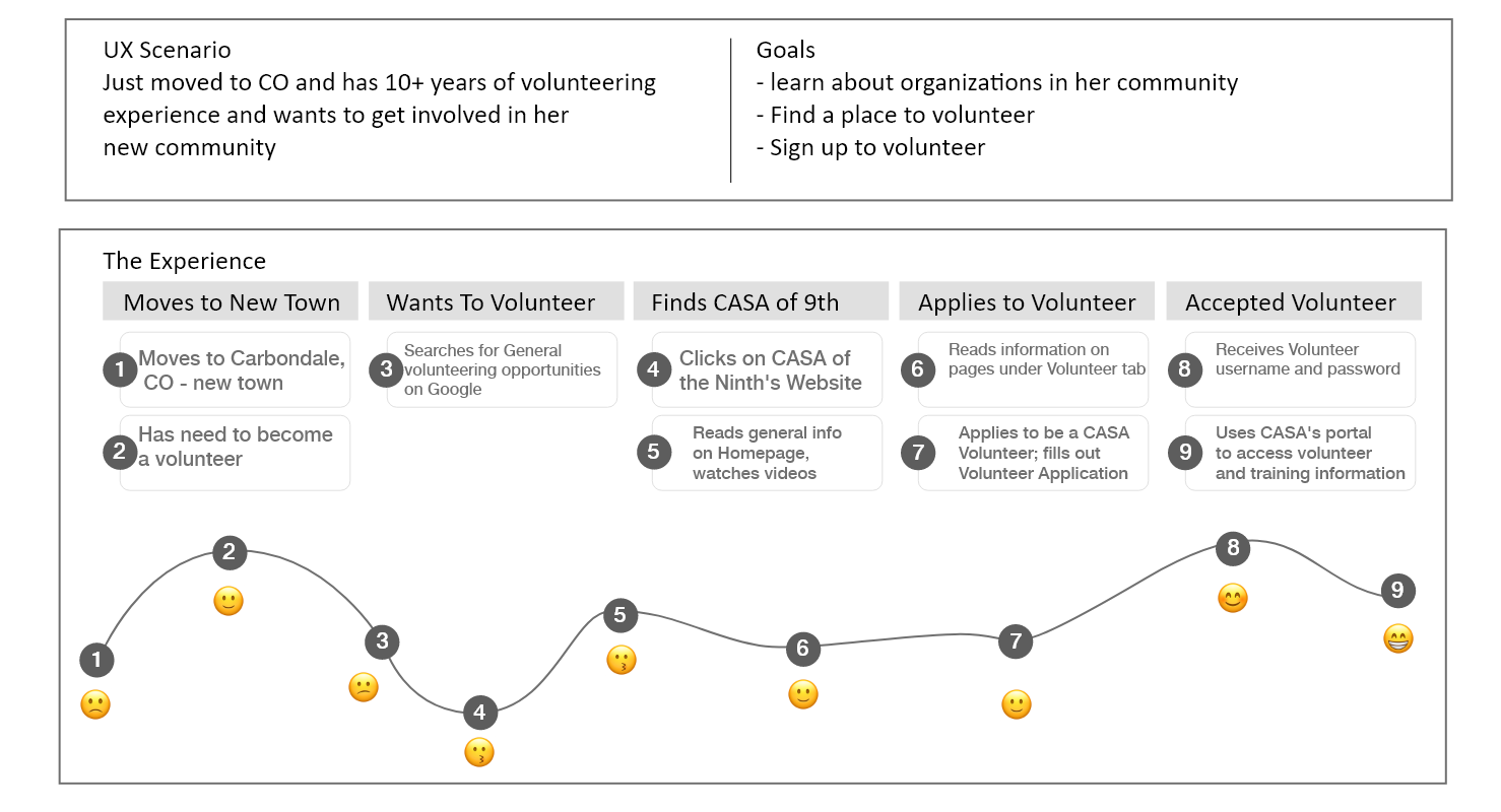
User Journey
With a defined user path we created a user journey map to better understand how a future volunteer may feel and experience the process of signing up to be a volunteer.
User Interviews
Once a proposed user path was determined, it was time to start testing. There were 6 user tests completed. Each team member conducted two user tests.
The user path for the test included the following:
- Finding the about page
- Learning how to become a volunteer
- Find the FAQ page, volunteer testimonials, and become a volunteer.
- Find the volunteer application and complete the form
'"Its difficult to know what the process is to volunteer. Having a page that walks you through the process may be helpful."
- Jessica S. User Tester
Card Sorting:
After the user tests, we had an idea of the items that needed to be included in the user path. Now we needed to organize it in an orderly fashion that makes sense to the user and future volunteers. We had a healthy turnout for our card sorting activities, and as luck had it, 65% of our users agreed on the organization of information for our navigation and site mapping.

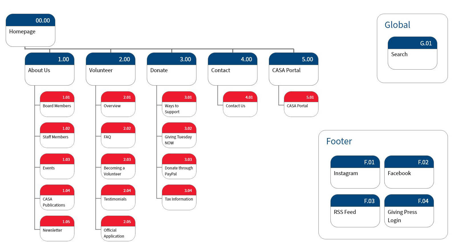
Site Mapping:
From the information gathered from our survey then card sorting activities, we began discussions over the information architecture for the site. We quickly came to an agreement for most of it. After a few iterations, the site map was complete, and we could move on to designing.
3. Ideate
Style Tile & Brand Guidelines:
We lucked out, we were able to obtain a copy of the CASA style and brand guidelines. This allowed us to recreate the new site with full brand compliance of the brand. We started with a style tile to complement the brand guidelines. We utilized the colors adding a light blue, updated a few fonts and added icons and buttons.

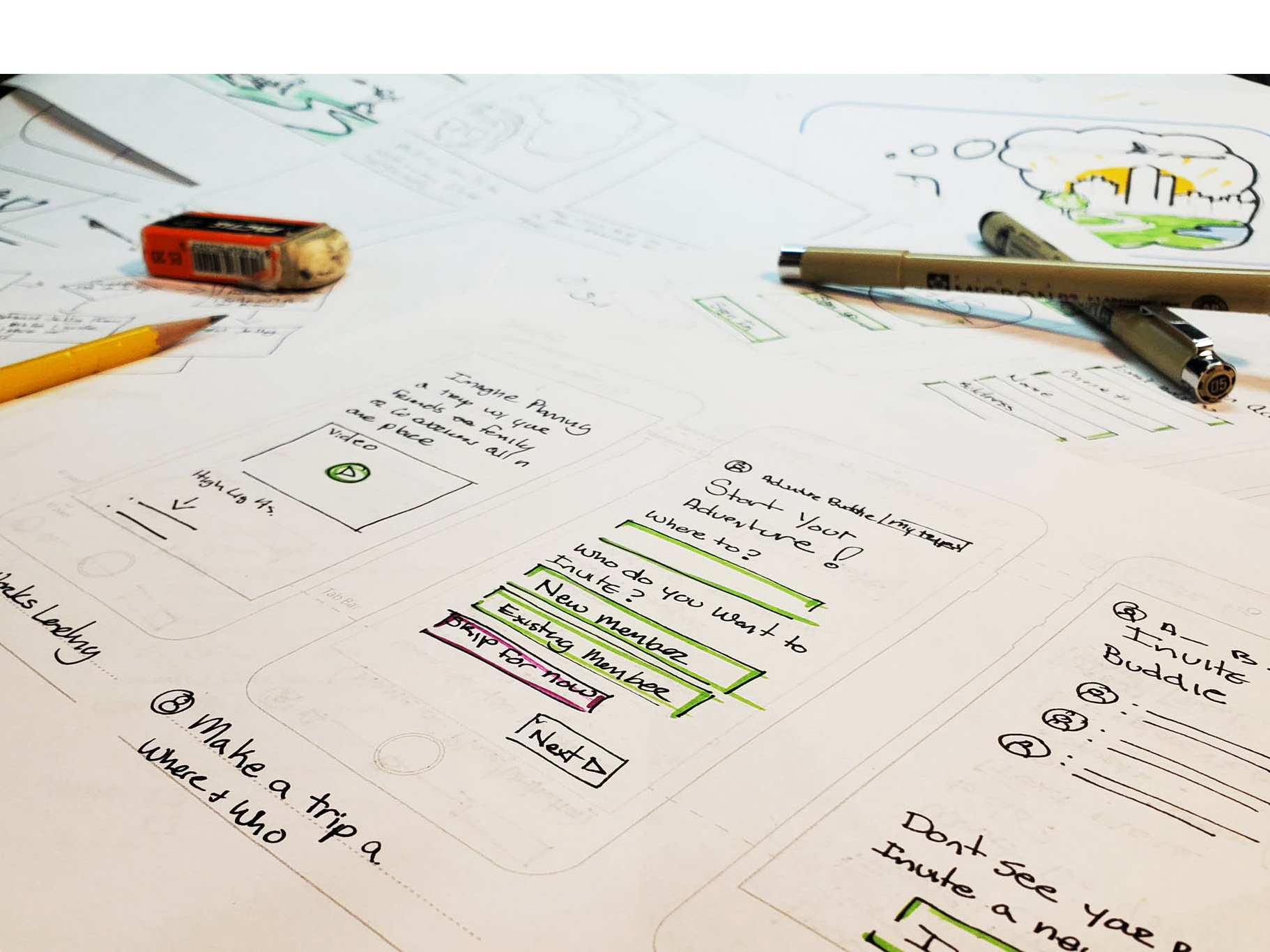
Sketching Wire Frames:
We lucked out, I was able to obtain a copy of the CASA style and brand guidelines. This allowed us to recreate the new site with full brand compliance of the brand. We started with a style tile to complement the brand guidelines. We utilized the colors adding a light blue, updated a few fonts and added icons and buttons. I started by crating rough sketches then refining them a little for a great conversation on what we wanted to do.
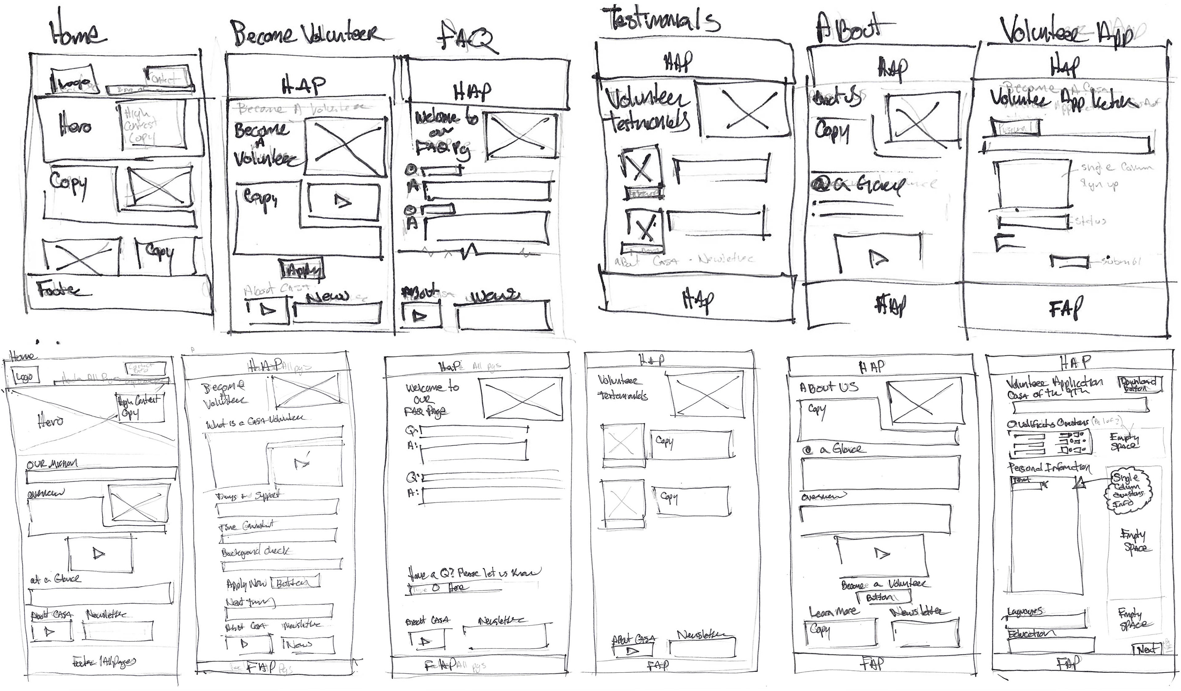
Low Fidelity Wire Frames:
Once we had an idea of where we wanted to end up one of my two partners partners created wire frames in Adobe XD.
Mid-Fidelity Wire Frames:
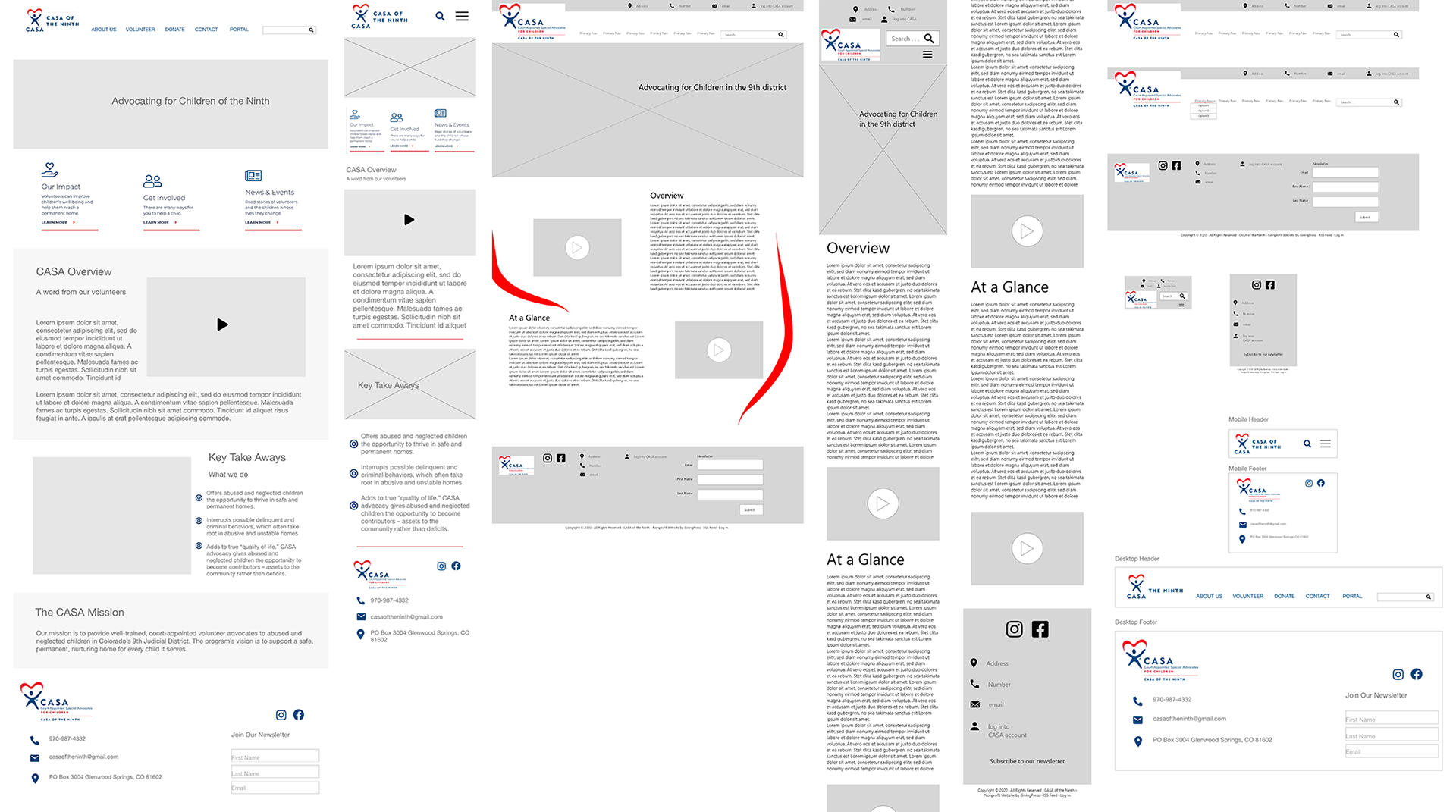
Combining the page layouts and the brand, we all took a third of the initial pages. Utilizing the Adobe XD Coediting feature, we created the Mid fidelity wire Frames. This allowed us to see how our design was matching with the other pages helping us to design in unison. At this stage, the brand was being added without content. This allowed us to visualize and scale items appropriately prior to adding too much detail.


4. Prototype
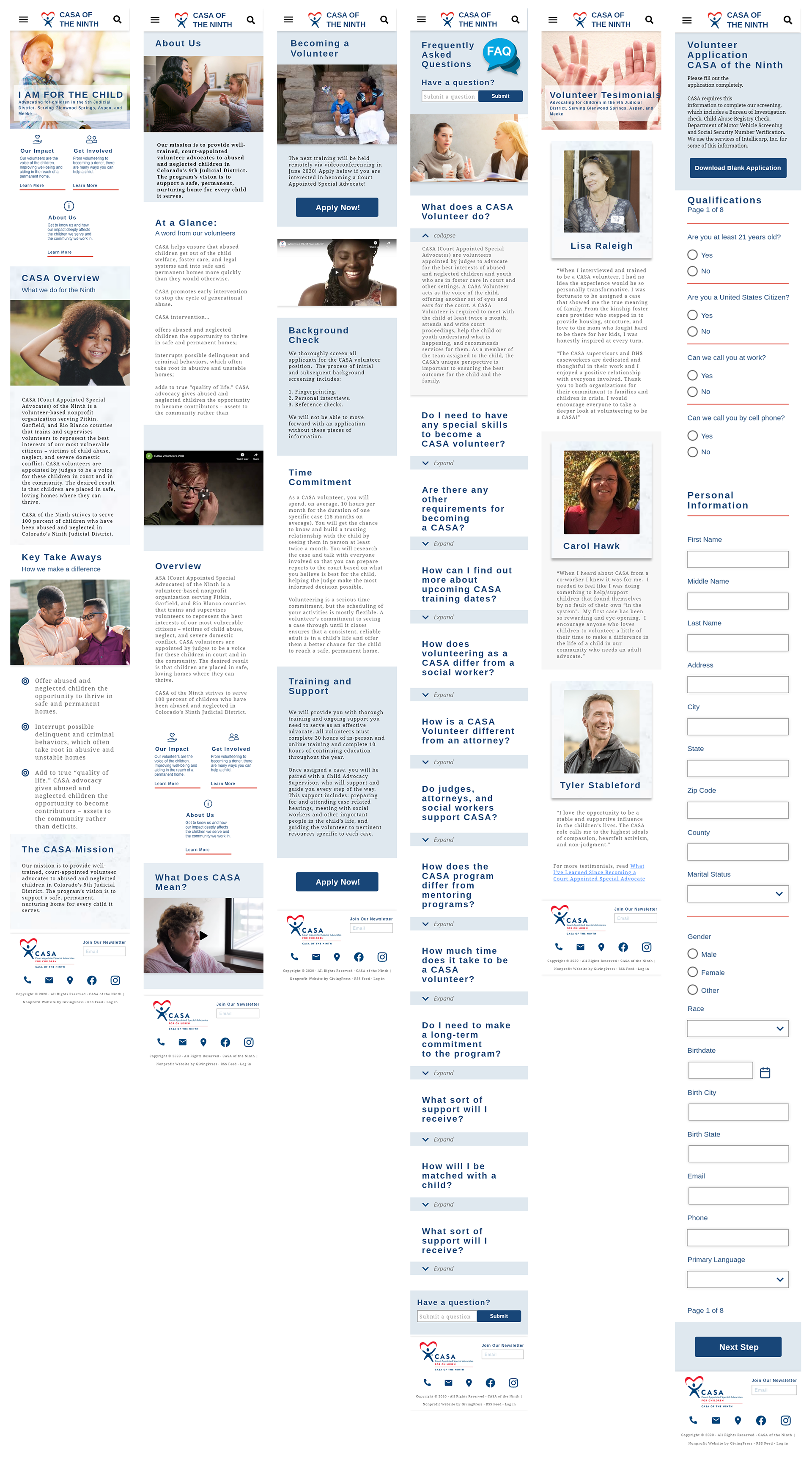
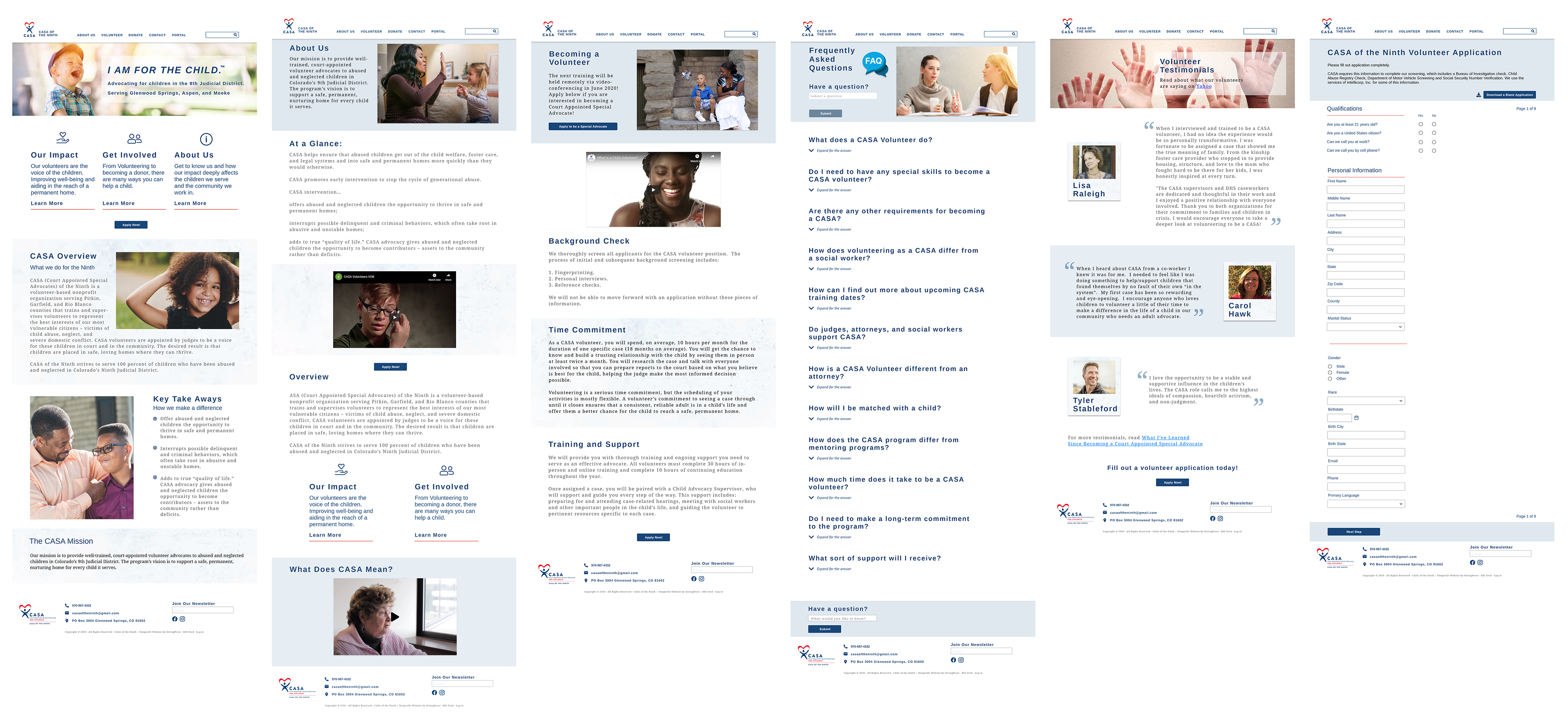
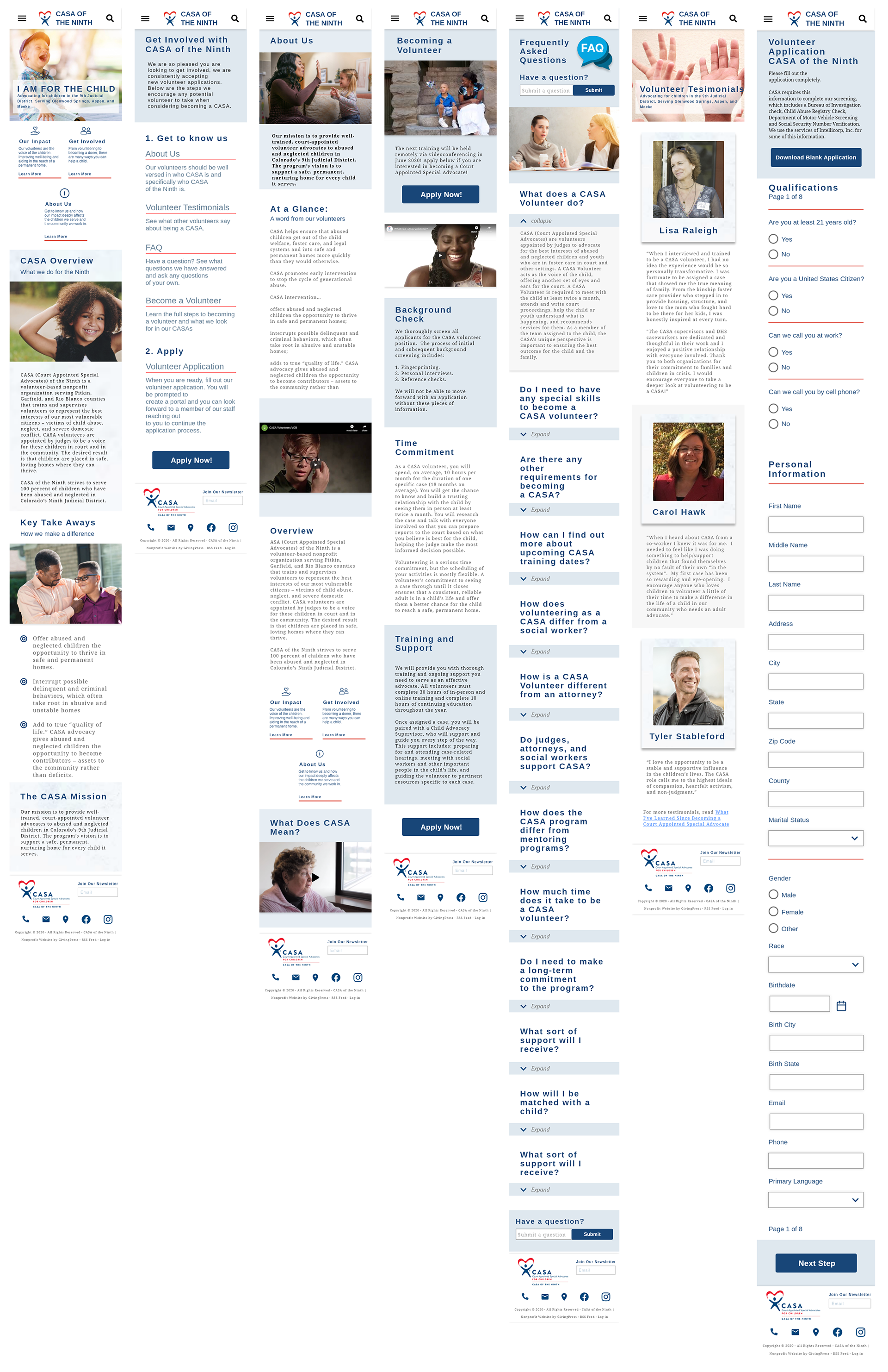
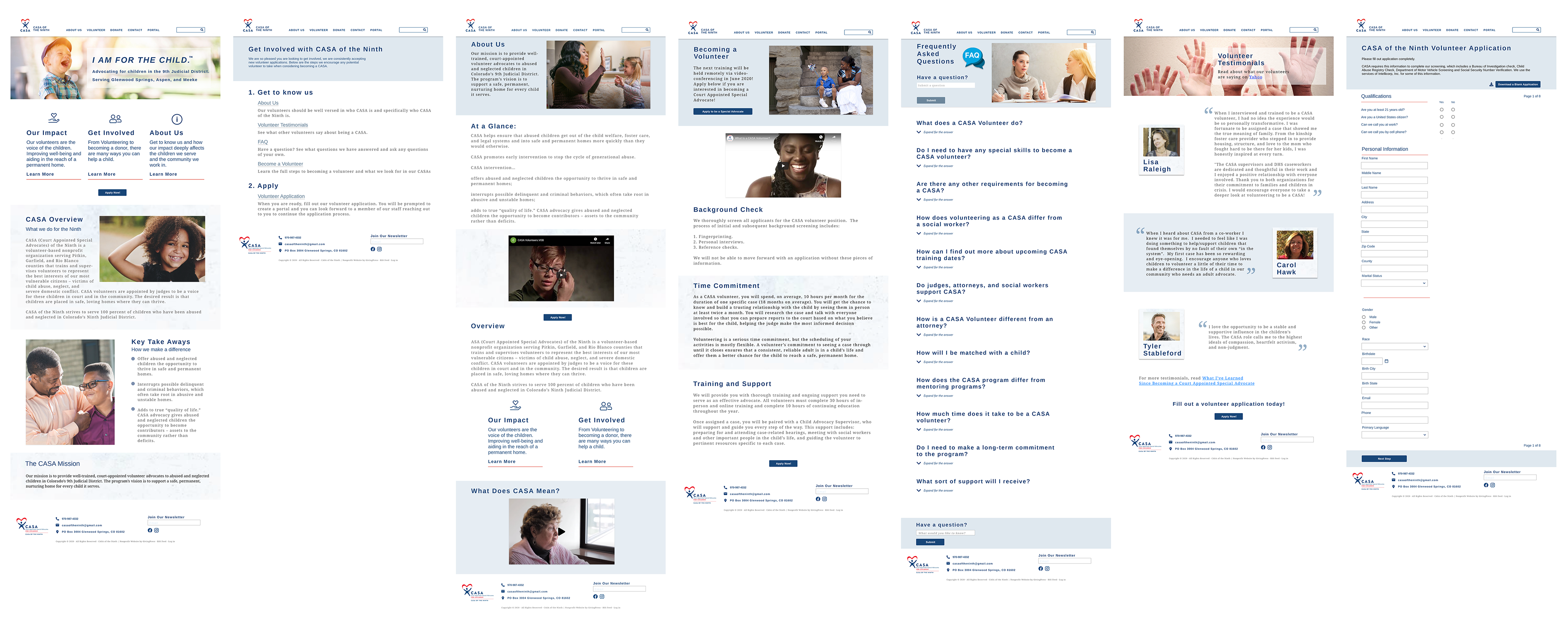
High-Fidelity Wire Frames:
Once we had a completed layout and a direction for the updated brand elements, the task at hand became to build out a prototype. As before, we used the collaborative design tool in Adobe XD and we each took one-third of the pages. I also built Mobile navigation. The copy in the CASA site was fairly complete, and didnt need many updates. Their images, however, were in need of updating. We found as many usable images off their site as possible and added more images to help round it out.
5. Test
Usability Testing:
Items Tested: Once we had a working prototype, another round of user testing was completed. We tested the same items and user path as we did in round 1.
- Finding the about page
- Learning how to become a volunteer
- Finding the FAQ page, volunteer testimonials and become a volunteer.
- Find the volunteer application and complete the form
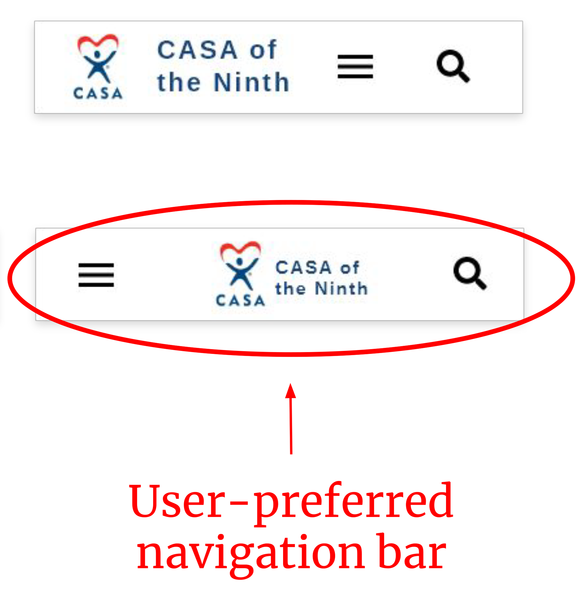
A/B test: We also A/B tested the preferred mobile header layout.
Changes made due to participant feedback:
- Corrected font sizes
- Relocated contact information from the top navigation bar
- Created a “Get Involved” page
- Added “Apply Now!” CTA buttons on more pages
- Updated primary navigation style
- Strengthened user’s direction in pages (where to do next, based off of user journey flow)
Prototype Testing Round 2:
Implementing as many of the modifications as we can we added the "Get Involved" page and many of the other items listed.
Design Review & Stakeholder Feedback:
Items to be addressed:
- Homepage iconography is out of scale for the feel. Copy size to be reduced and Icon increased.
- Better use of white space on application page, to reduce the white space on the right side of the page.
- Call to action work, The site needed more CTA's, and we will add them.
- footer navigation needs to be added for better navigation.
- Visual accents, the FAQ page could use a better visual split between questions.
"The website looks very clean & uniform
I love the design overall and will be showing your designs to our designer for possible implementation and at the least, more feedback"
- Jessica Ownigs, President
Opportunities and Prioritization:
Reduce visual clutter
Right size iconography & copy
Add navigation in the footer
Improve user flow (less scrolling)
Add more pages to prototypes
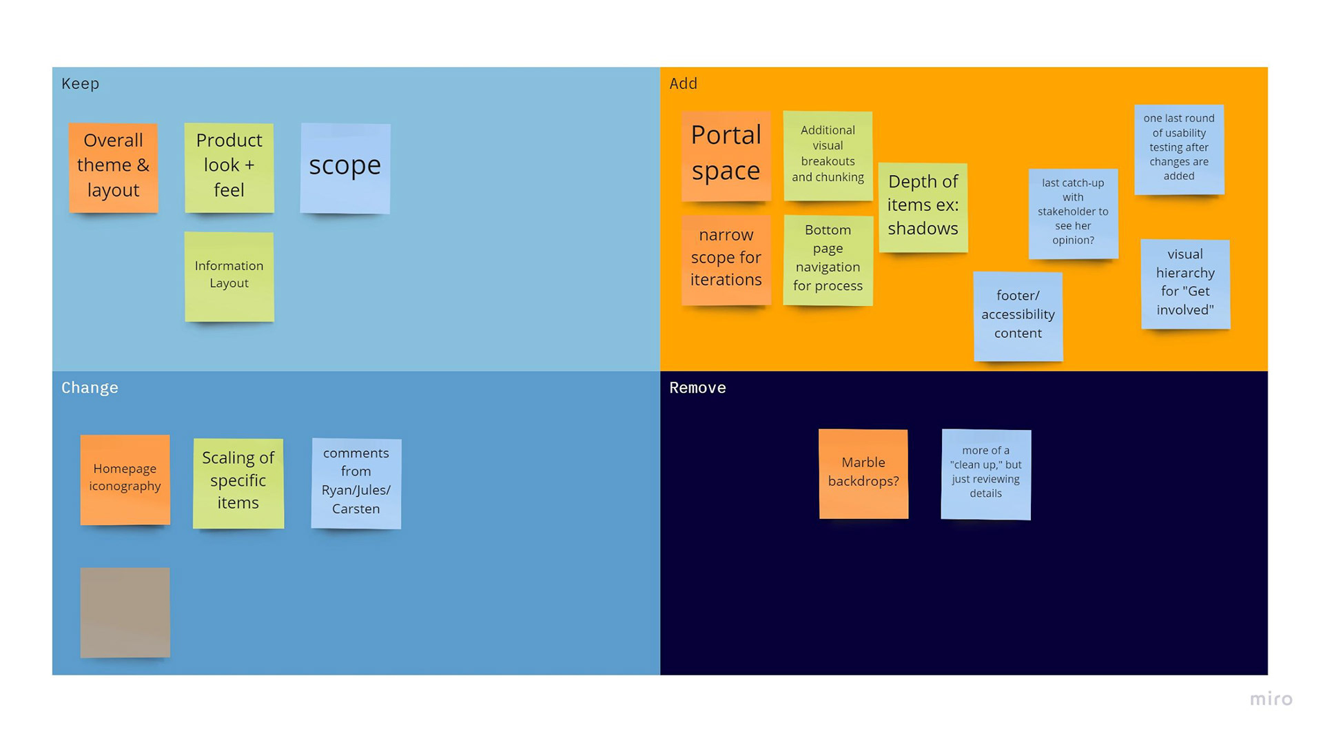
Design changes for the Latest Prototype:
Home Page Iconography - Corrected icon size & made card copy same as hero size copy.
Marble background removal - cleans up pages and aids in overall site cohesion.
Footer Navigation - to better aid in accessibility & account for errors that may mess up the sticky header.
Application page reorganization - Reduce scrolling time & better use white space real estate.
FAQ Update - adding a red divider that we have throughout the prototype to create better cohesion.
Application page reorganization - Reduce scrolling time & better use white space real estate.
Added Pages - two new pages to broaden scope Portal Sign In & Board Members
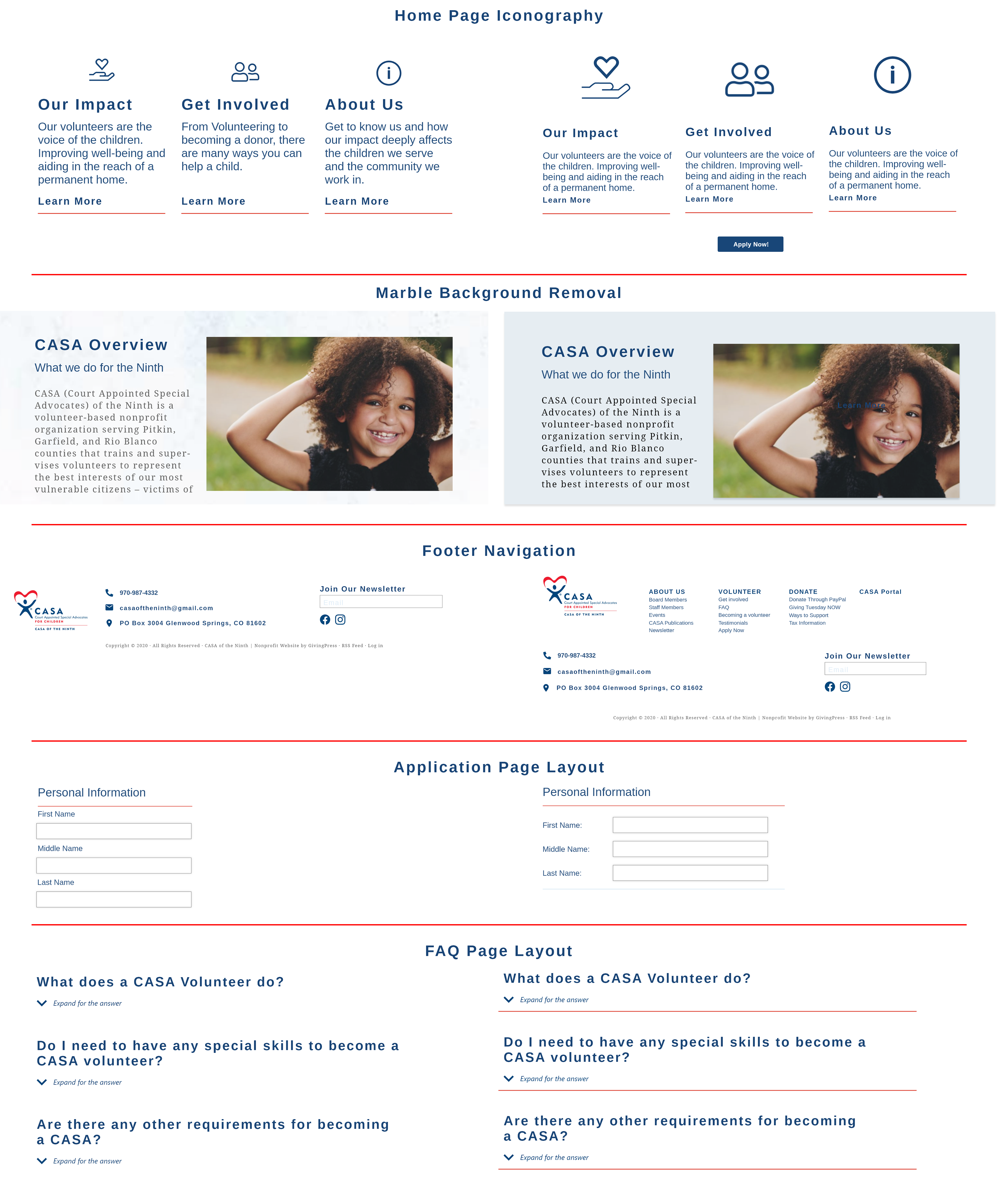
Changes from a Users Perspective:
Clear up visual hierarchy/separation - The user will know exactly when sections start and end
Less clutter is easier on the eyes - Reduces cognitive load
Strengthen atomic design (cohesion) - Everything looks more professional and trustworthy
Strengthen user flow/direction -Users will clearly understand where to go, or what information is available to them when completing a page
Lessen scrolling on pages - Less time, less wasted space
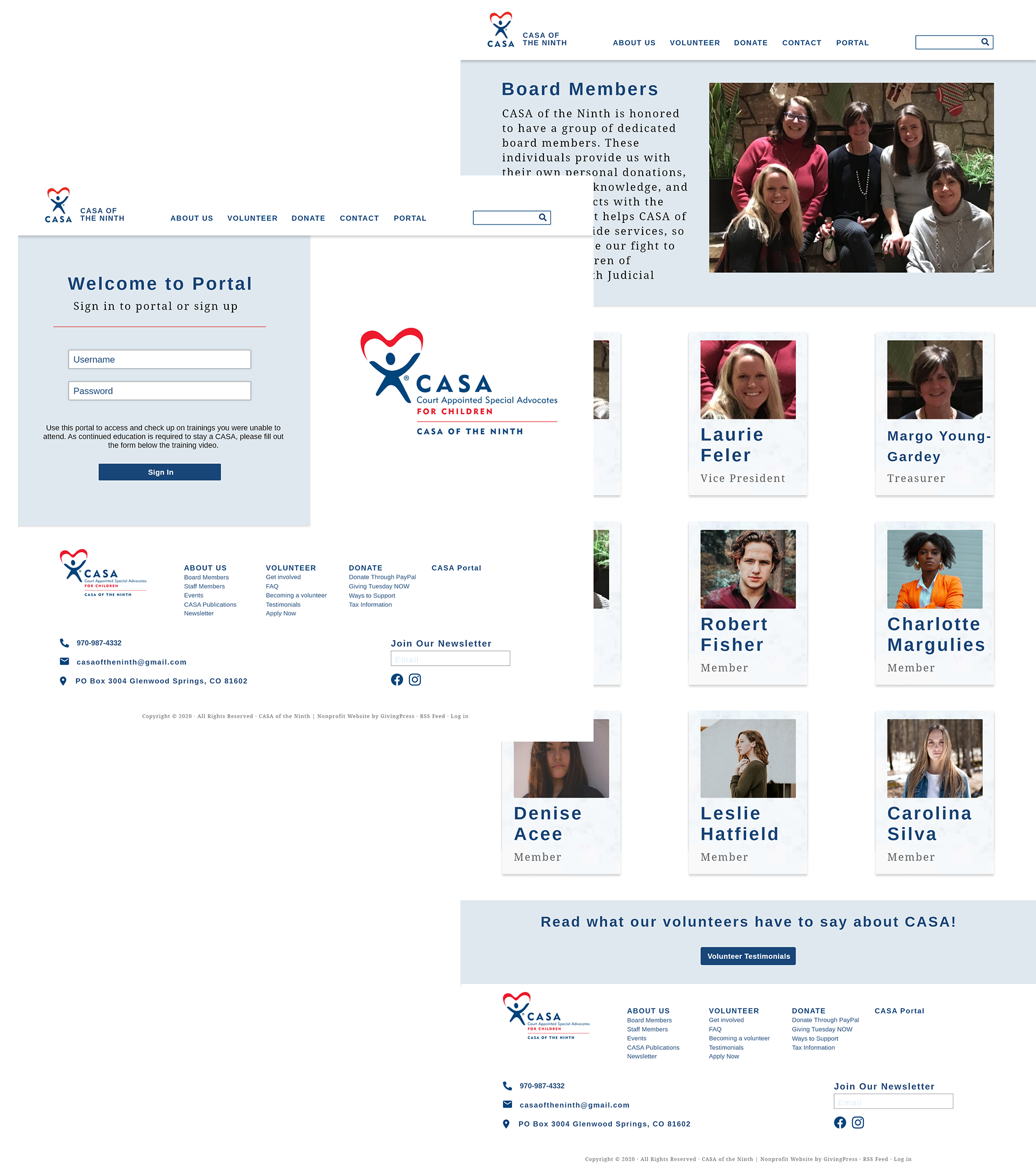
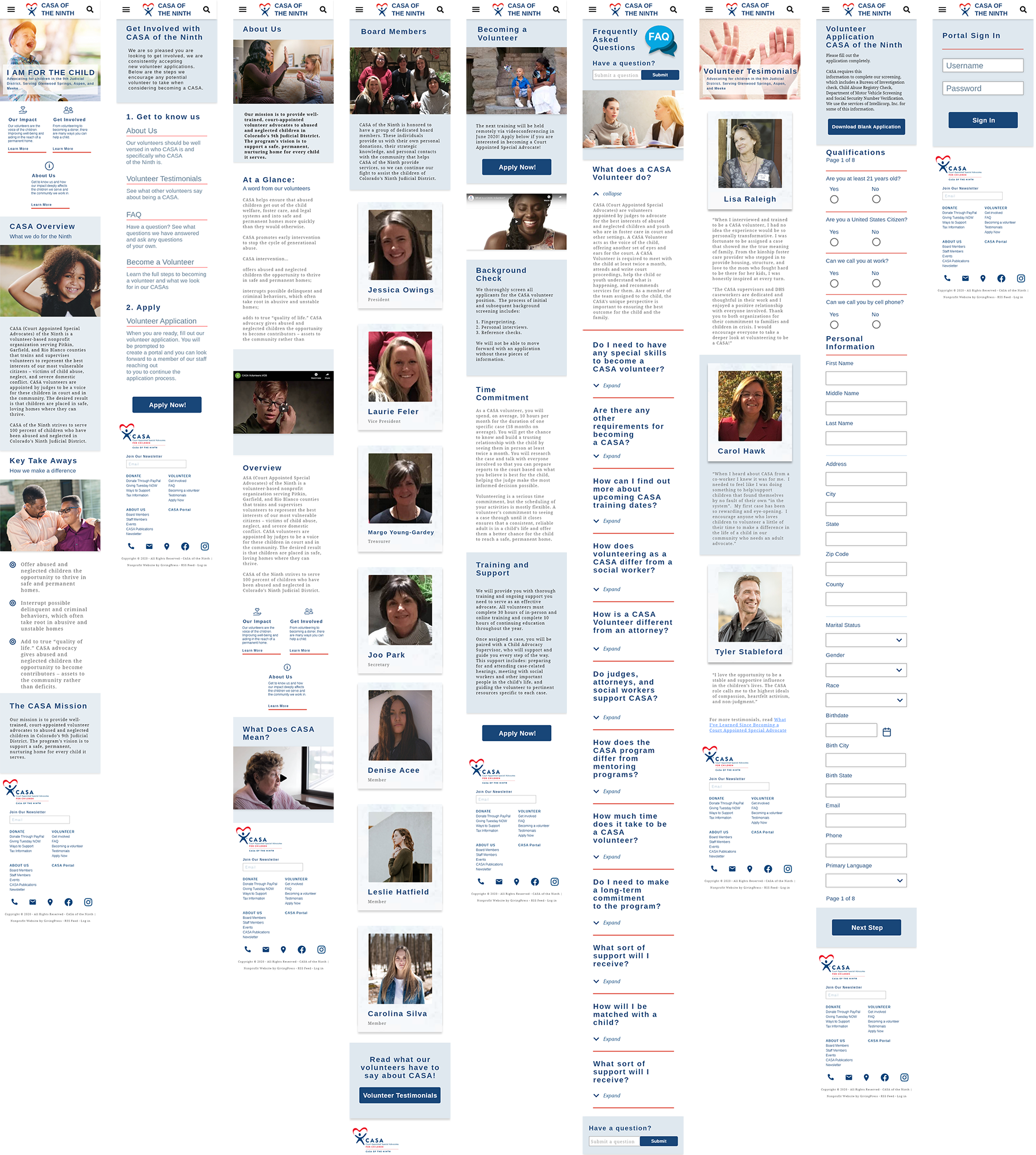
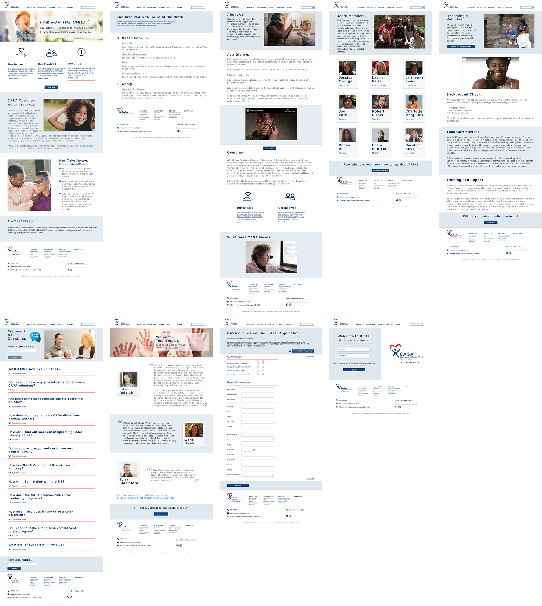
Latest Prototypes:
Demo Videos: