
Department of the Interior: A mobile-first UX / UI site redesign project
THE PROJECT: The Department of Interior website needs to be overhauled.
It does not clearly define departments, roles, or scope, creating confusion when navigating the site. It is also very copy-heavy and would benefit from better visual representation.
GOALS AND OBJECTIVES: Start with a mobile-first approach that divides information into digestible modular pieces. Then add a more colorful pallet that better complements the diverse range of photography and information on the site.
MY ROLE: UI designer (Individual Project)
TIMELINE: 4 Weeks
TOOLS: Adobe XD, PS, AI, Miro, Invision
My Process
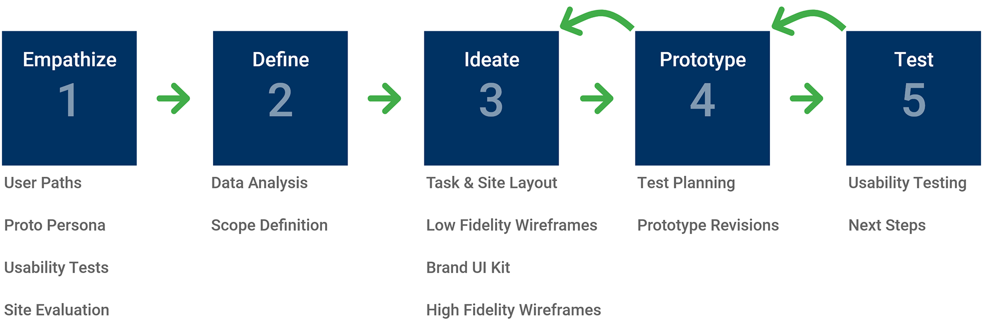
1. Empathize
Explore User Paths:
To better understand the Department of the Interior's (DOI) mission and what its site does, I spent many hours reviewing the existing content, structure, and links.
Once I understood the site and how it was being used, three user paths became apparent. These three user paths would be my initial focus.
1. Learn about the DOI and what they do
2. Locating news feeds and associated articles
3. Finding open employment opportunities
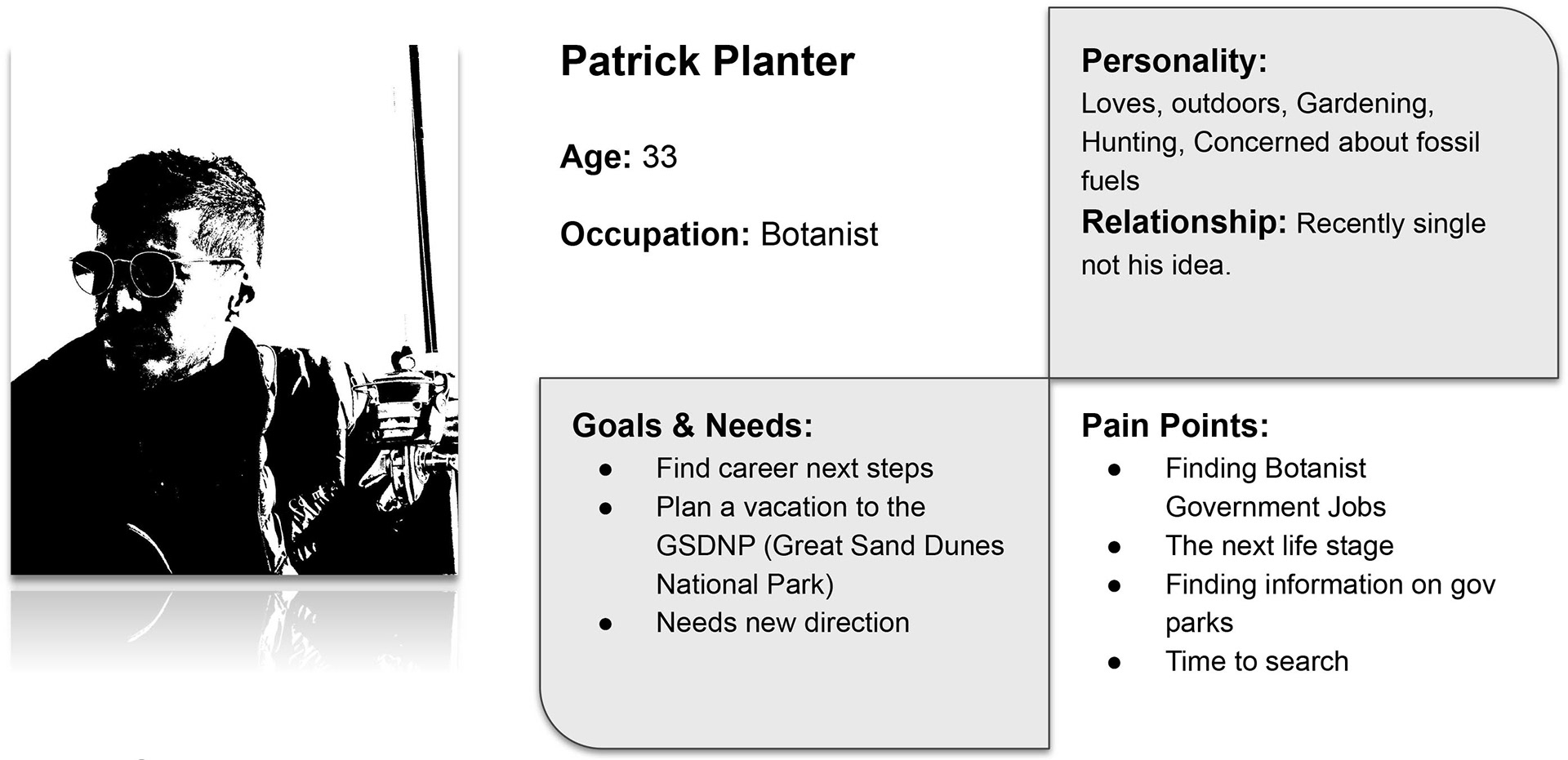
Proto Persona:
In searching for a persona who may utilize the DOI site, Patrick Planter was realized.
Patrick, a 33-year-old Botanist, is looking for a new place to be a Botanist. In his search, he heard about the DOI and some of their new opportunities.
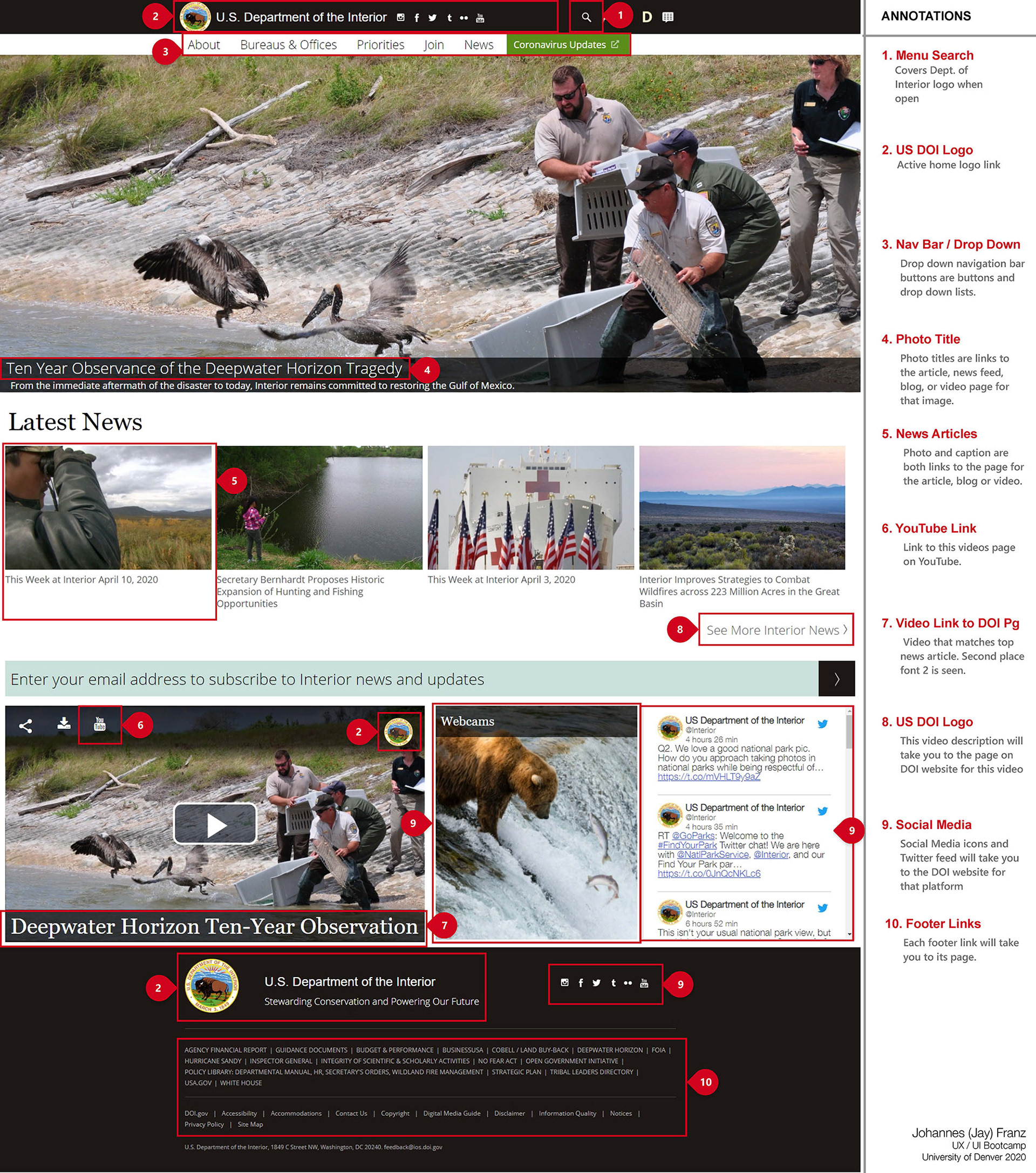
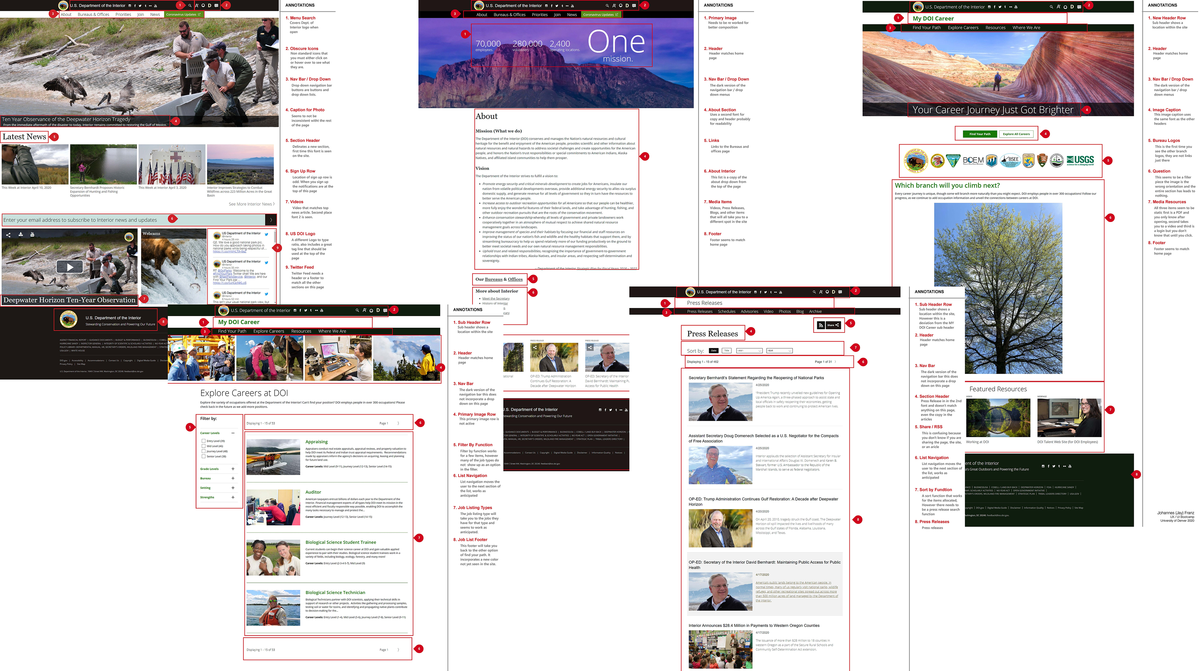
Site Heuristic Analysis:
Once familiarized with the DOI site and layout, I began to better analyze and familiarize myself with all of the items involved. A heuristic evaluation was completed to bring light to the items I found that may need attention. I then created Annotations to help clarify my findings.
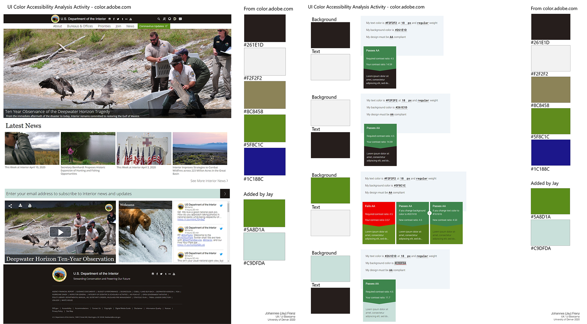
Site Color Accessibility Analysis:
Understanding the existing site contrast and colors is an essential step in building a new site and brand. I wanted to keep stronger brand assets when rebuilding the brand.
Once I understood the site and how it was being used, three user paths became apparent. These three user paths would be my initial focus.
Site Navigation Analysis:
To better empathize with the user and future testing participants, I analyzed the relined site layout and navigation. This aided me in understanding what needs to be tested and redesigned.
Understanding the DOI Brand:
Who We Are:
- We help regulate and provide clarity on rules and procedures for many different organizations in the United States.
- Strive to be an essential partner for you or your organization when trying to accomplish business and leisure objectives.
- We want all communication and interaction to be consistent, pleasant, and neighborly.
- We strive to create value for the taxpayers who want the services provided.

Brand Analysis:
Public Identity Physical: Encompassing the amber waves of grain through the majestic mountains between two oceans. We provide the structure and resources to carry the country.
Public Identity Relationship: We are your resource that protects the natural environment and indigenous tribes while allowing the use for commercial and recreational activities of the land.
Public Identity Reflection: We are your neighbors, your friends, and colleagues.
Internal Identity Personality: As stewards of the land and its people, we must be kind and understanding yet firm to protect our natural resources and further relationships and industry.
Internal Identity Culture: A family-like environment with control over some of our most coveted resources. That creates a sense of trust and unity throughout many Departments and Bureaus.
Internal Identity Self-Image: A trusted advisor that can help and protect and serve the US taxpayer and the resources they own.
Brand Character Traits: Governance, restraint, native, regulation, essential, indigenous, inherent, neighborly, valuable, accommodating, instrumental
Voice Do:
- We strive to provide clarity on regulations for your projects.
- We want to be an essential partner with you in achieving your goals.
- Contact us when you have questions about regulations and we will strive to respond in a pleasant and neighborly way.
- The value we create and can provide is beyond just what you see. We are entrusted with protecting natural resources, people, and the environment.
Voice DO NOT:
- You will comply due to regulations regardless of your opinion.
- We are essential, if you don’t work with us, you won’t get what you want.
- Sometimes, we may seem neighborly but remember, we are still the government.
- We create value that helps people with digging things up and polluting the environment.
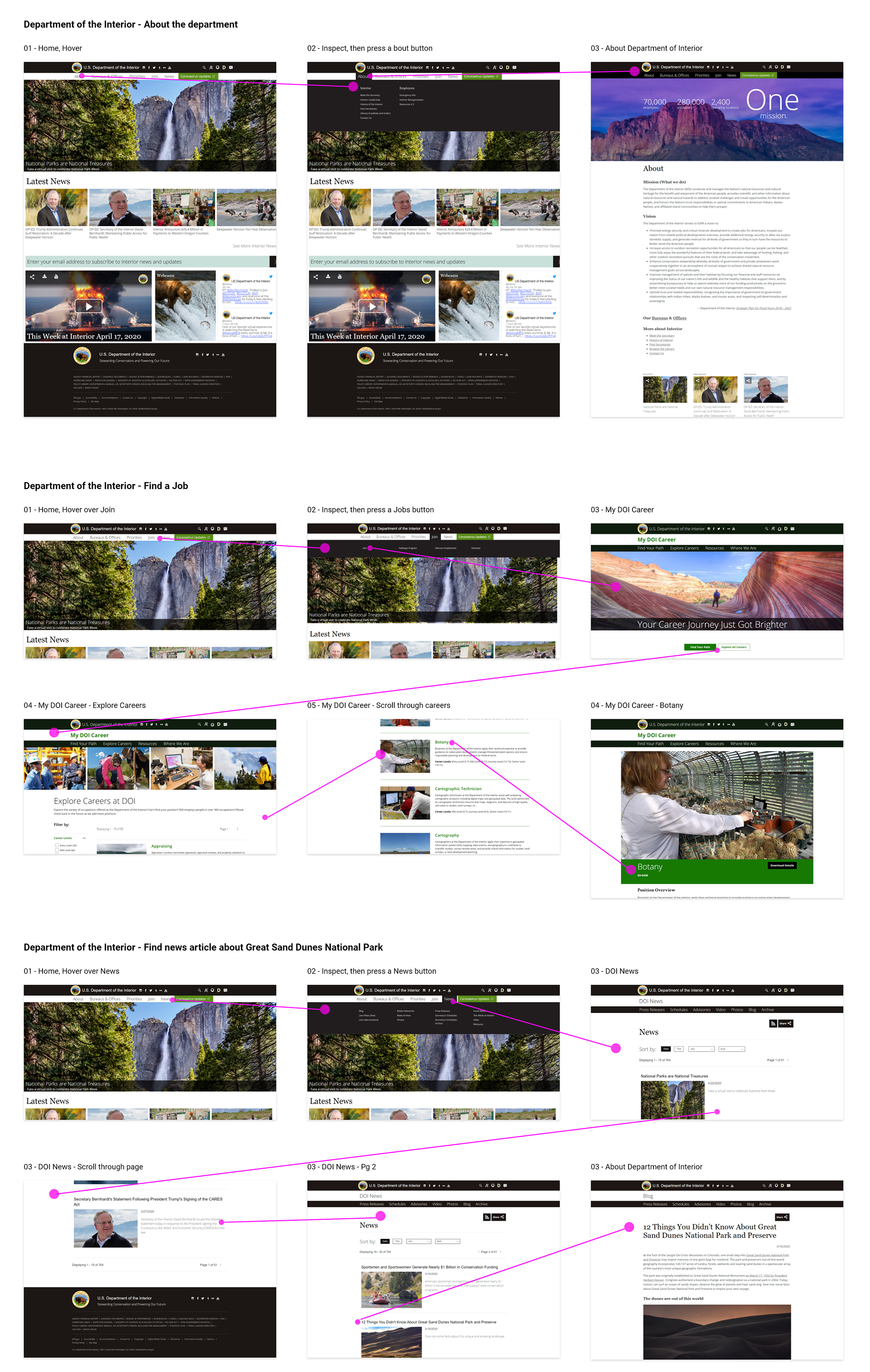
Usability testing:
The goal was to test the existing layout and style against the tasks the users were asked to accomplish. The tasks included key components such as navigation, user interfaces, and information architecture.
Test Tasks:
- Finding the About Page to understand the DOI better
- Learning about Bureaus and Offices
- Finding the Botany Job Listing
- Finding the Great Sand Dunes National Park blog
Testing Data:
5 User tests were conducted
Due to the covid-19 pandemic, all tests were conducted via remote communication. This allowed me to record the users' actions, facial expressions as well as commentary as I reviewed the data.

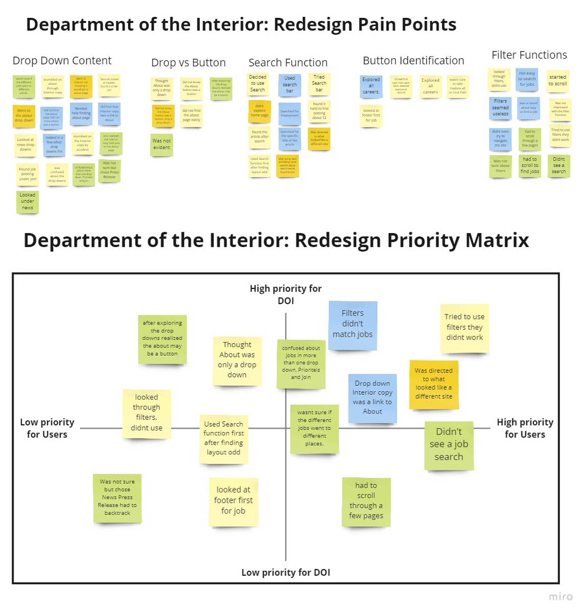
Making sense of test results:
Compiling the data into usable chunks, 5 distinct categories were evident.
- Drop Down Content
- Drop Down vs. Button
- Search function
- Button Identification
- Filter Functions
These categories were pain points for almost everyone involved in the user testing, making it easier to narrow the field to these subjects.
I then created a Priority Matrix. This aided the process of tackling the important issues first.
2. Define
Navigation Concepts:
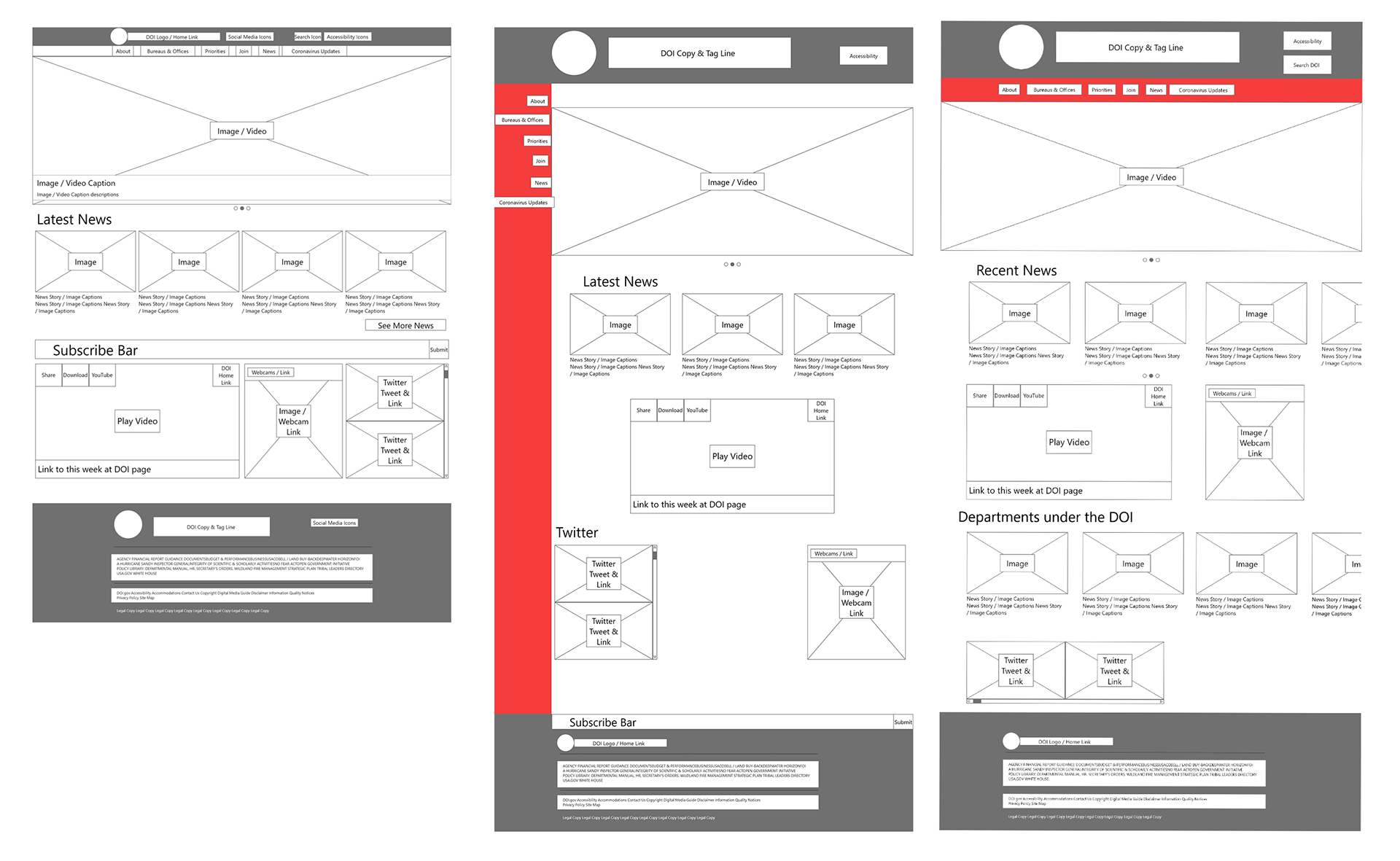
Taking the information from the user pain points and the priority matrix, I needed to decide which type of navigation menu to use.
I created three low-fidelity wireframes to better understand the current layout.
After better understanding the design of the DOI site, I explored two different options for navigation placement. The top header or a side navigation panel. When exploring these options, two additional wireframes were created to show how these may look visually within the page and mobile applications.
These navigation wireframes also served as preliminary information layouts for the home page content.
Navigation Card Sorting:
When recreating the information architecture, I used the card sorting process to solidify the general understanding and expectations held by users. In the card sorting activity, there were 6 participants. Their contribution guided the information layout and design.

Mobile & Web Navigation Wire Frames:
Once a direction was clear based on the card sorting activity it was time to build a quick prototype of what these concepts may resemble.
Starting with mobile a general header and footer were built.
the header and footer templates were created. This allowed me to build the larger web version concept.

Navigation Wireframe Testing:
As a quick and actionable way to see if I was on the right track, I conducted three five-second navigation tests.
The information gathered verified that the new layout was easier to comprehend and would reduce cognitive load on the user.

3. Ideate
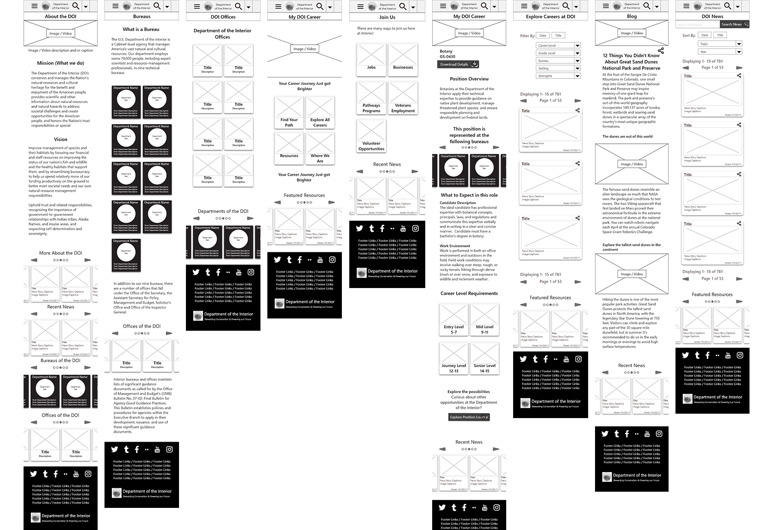
Creating Mobile Wireframes:
After narrowing the navigation to essential DOI topics and functions it became clear that some items such as bureaus, offices, and news were heavily trafficked items. This opportunity gave birth to cards and carousels for groups of information such as the latest news, Bureaus, and Offices. Utilizing an Atomic Design strategy gave me the flexibility to move organisms and templates from page to page with ease. For the best RWD, a 4-column layout was used on mobile and 12 columns on web.
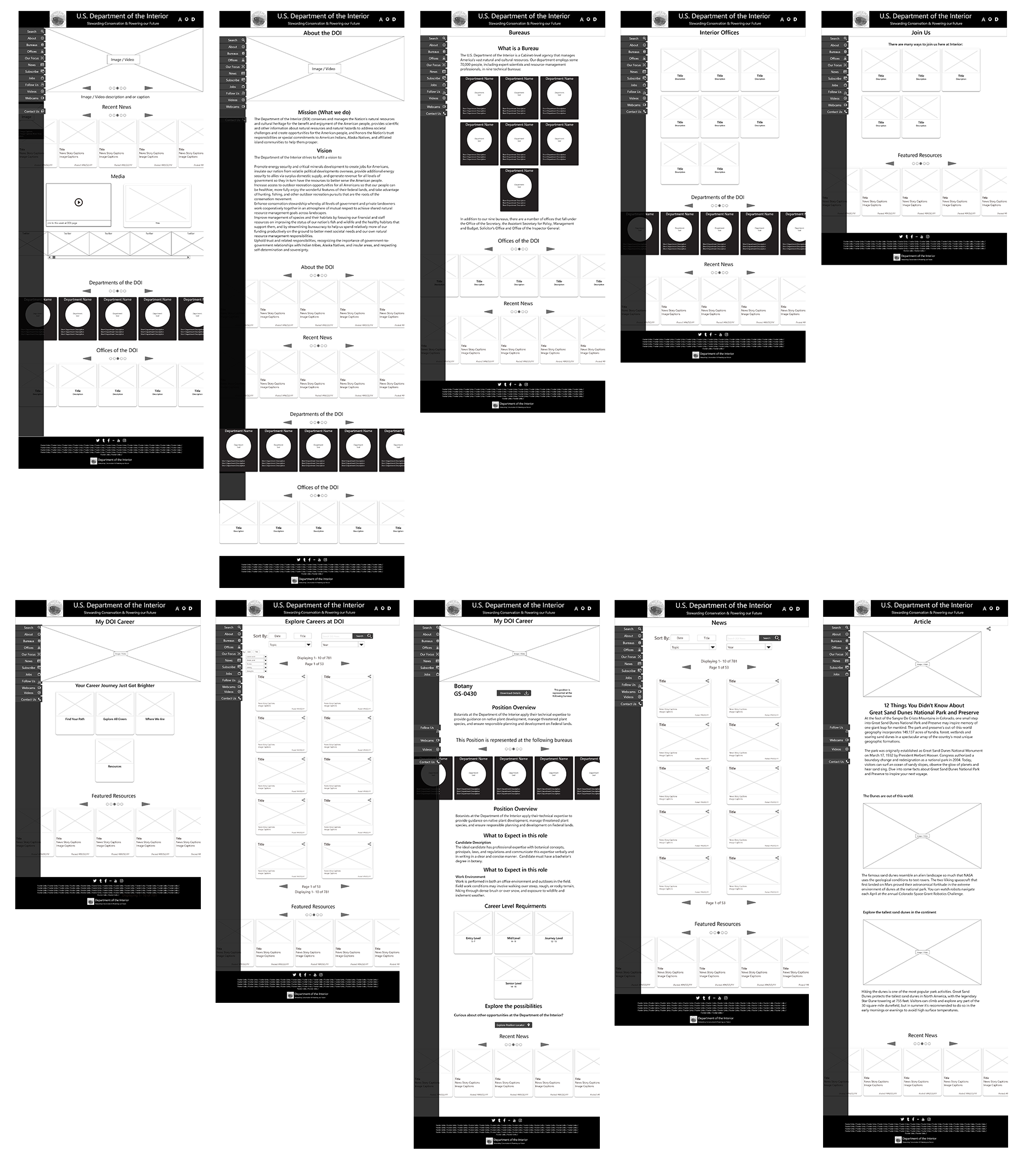
Creating Web Wireframes:
Taking the elements, layouts, and information hierarchy from the mobile version the web wire-frames the concepts and elements from mobile were expanded into larger format options.
Updating a Brand: Mood Board
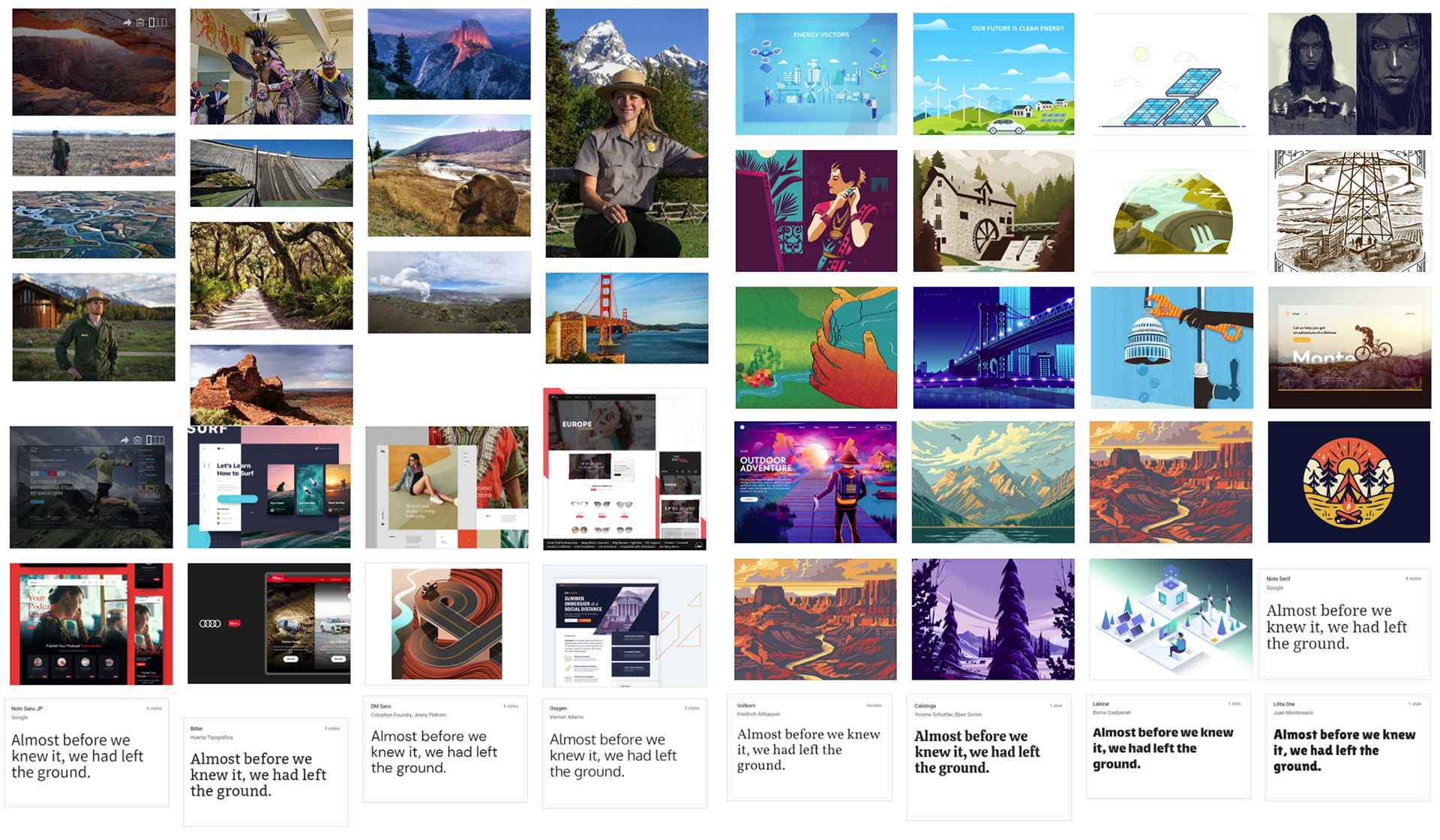
The DOI has many different organizations contributing content. White all images used in prototypes were DOI in use images these are inspirational for my vision. These include look and feel, organizational UX, brand images, and fonts.
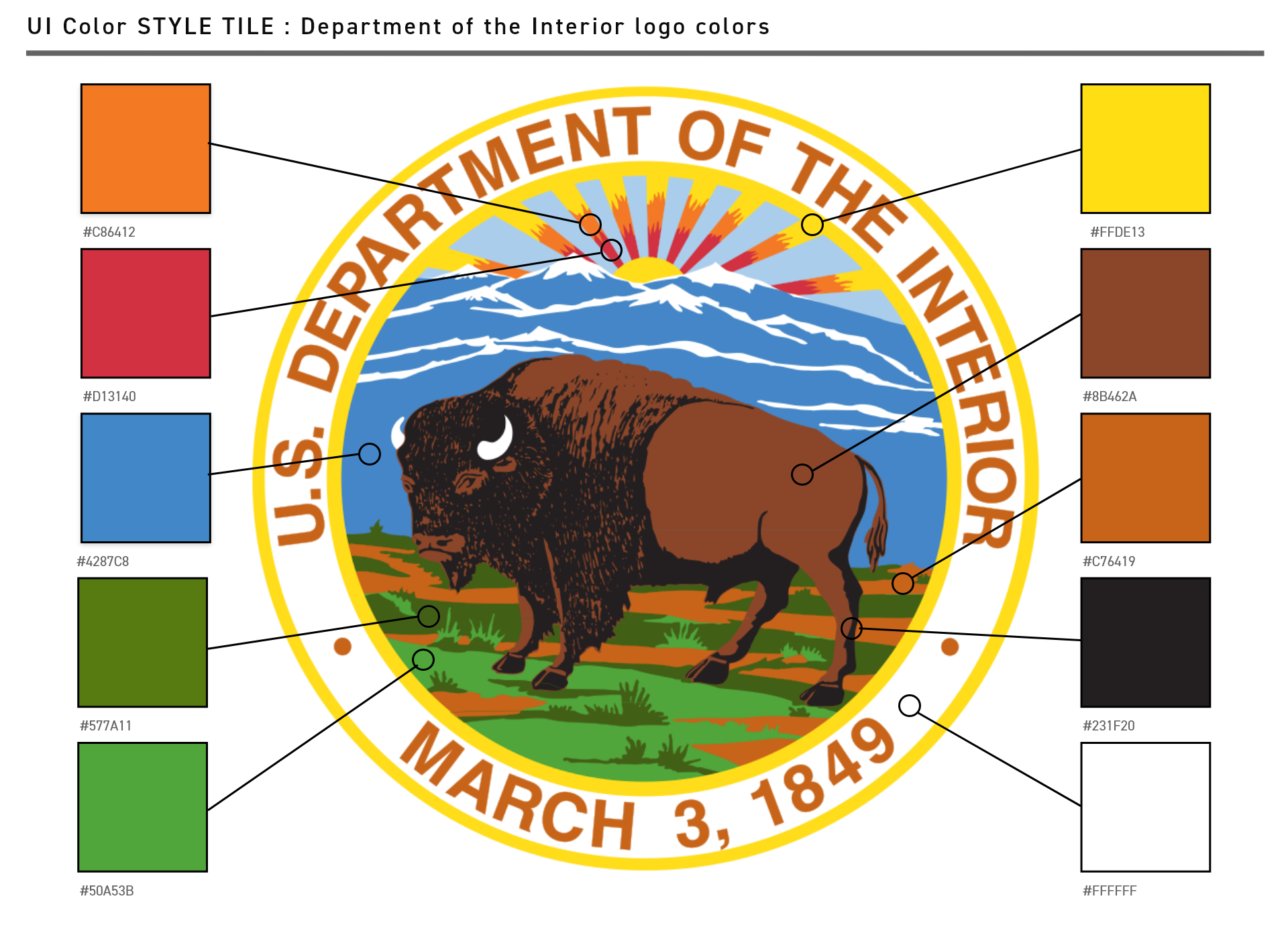
Updating a Brand: Color Pallet
The existing color pallet for the DOI is basically black, white with a few mute colors here and there that seem to have no reason. I wanted to utilize the colors depicted within the U.S. Department of the Interior seal. The DOI currently uses this seal as its logo. Below you will see the color pallet generated from the DOI seal.
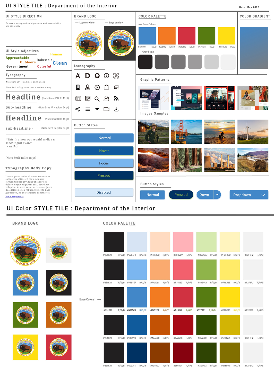
Updating a Brand: Style Tile
Style Tile:
Many of these bold colors may be distracting. There fore Icons, Button and other staple items on the site remained calmer colors such as blue, grey and black. Brighter more eye catching items will be used as accents.
Color Pallet:
Expanding on the existing brand colors lighter and darker versions of each were curated. This expanded the use of each color and aided AA and AAA contrast for best advisability.
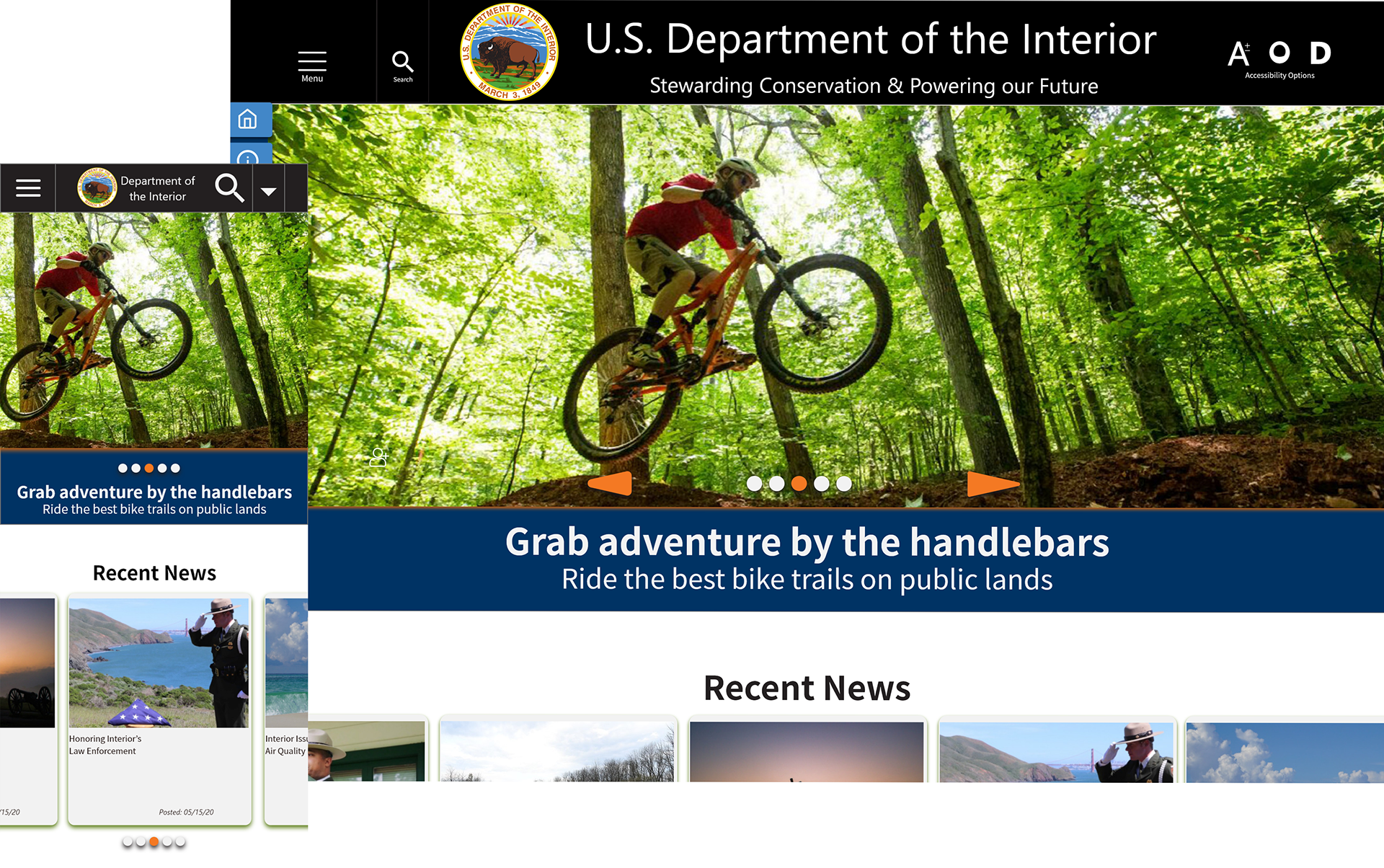
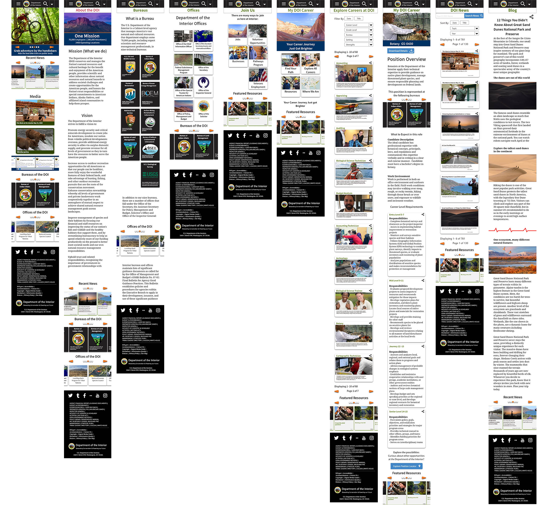
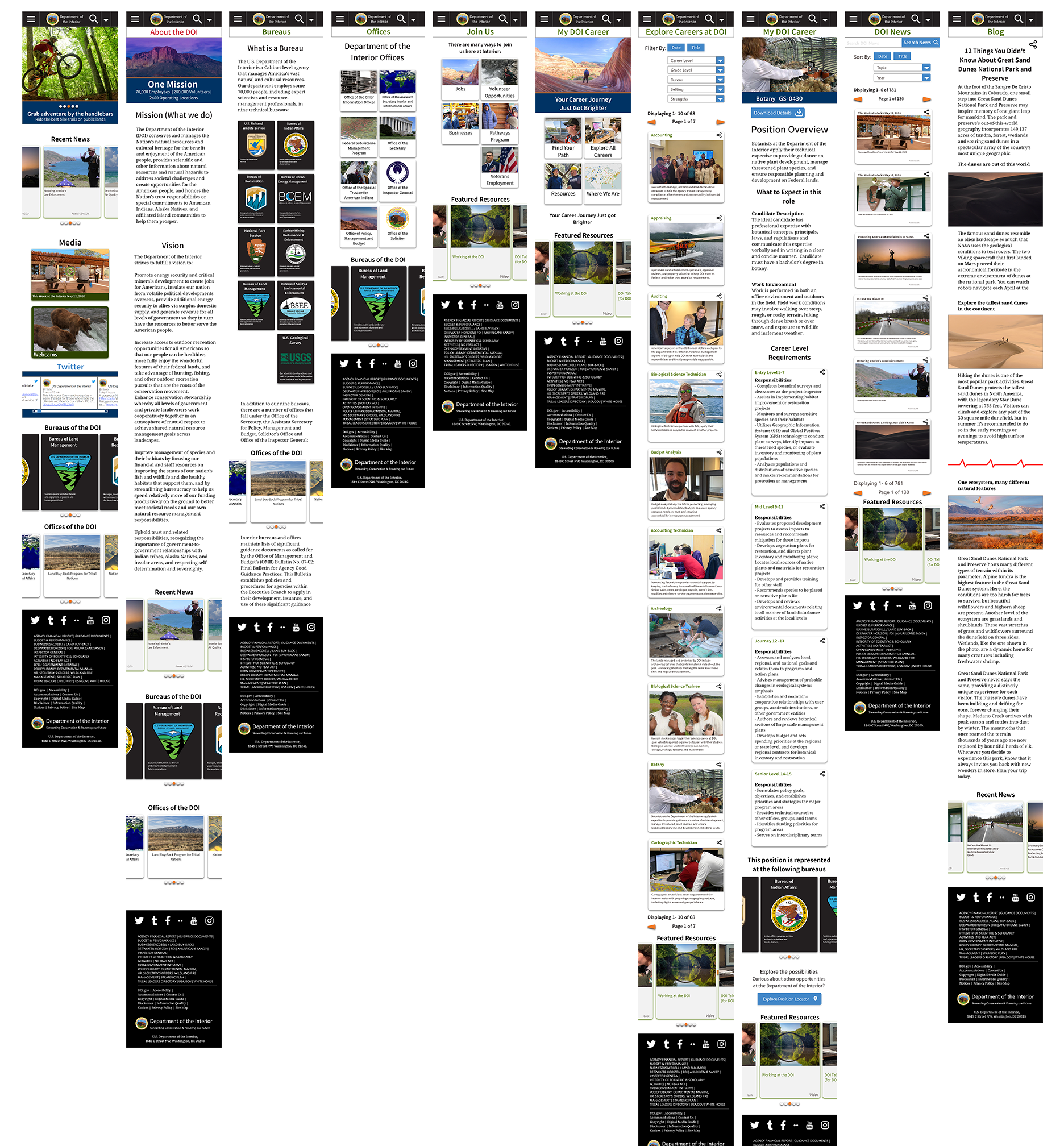
Brand Application: Mobile High Fidelity Prototype
Bringing it all these elements together was a joy. I began by slightly refining the wire frames prototypes to better fit the format. Then applying design assets and styles taken from both the existing site and style tiles.
Once built it was examined by myself and a few colleagues to help spot design flaws, inconsistencies, scale issues and missing information. A few rounds later it was time to connect buttons and create the micro interactions for prototype testing.
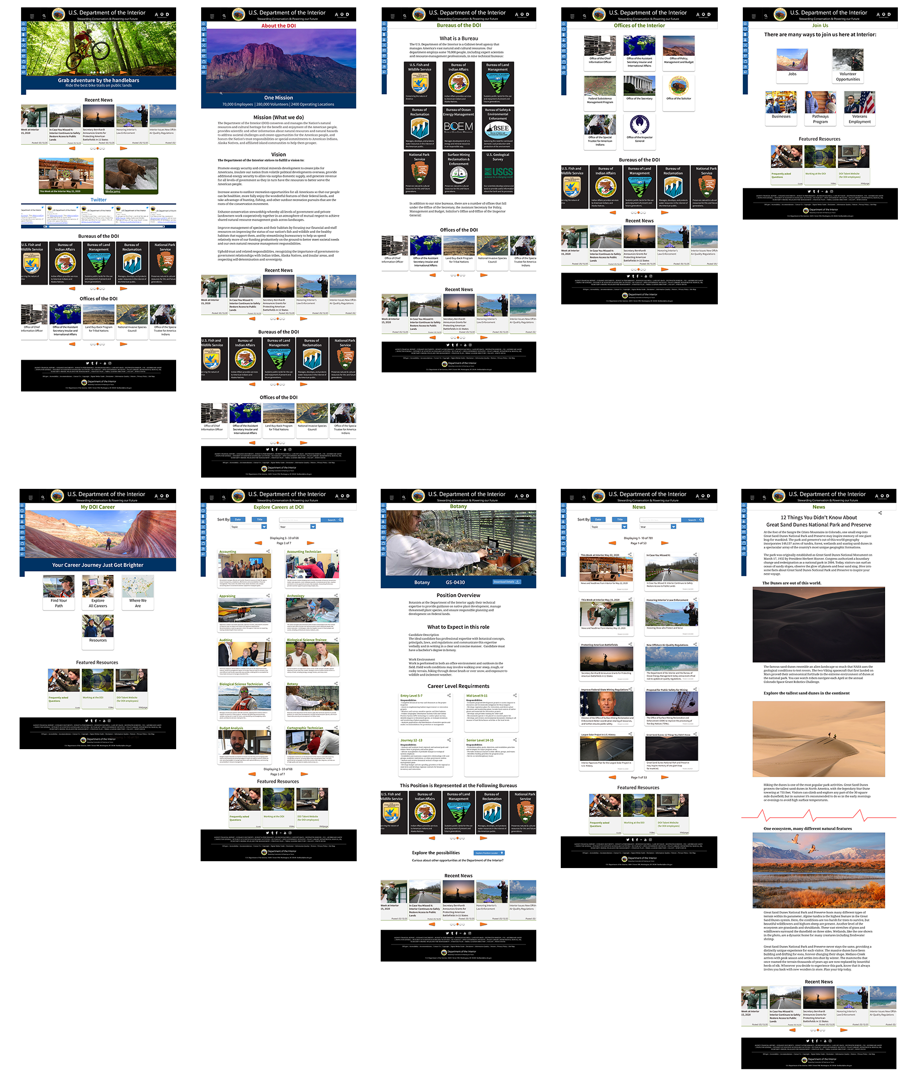
Brand Application: Web High Fidelity Prototype
A min component to the updated web version was the side bar. User comments suggested it took up too much room and they would have preferred to see it smaller. The solution was to hide the copy and show icons until it is clicked.
4. Testing
Prototype Testing:
10 User Tests Completed
Tested 5 Mobile and 5 Web versions
Participants Ranged in age from
13 to 72 years old
Method & Participants Goal: To test the layout and style against the original user tests. This included Navigation, information layouts, and visual chunking of heavy text information.
Tasks Tested:
- Finding the About Page
- Learning about Bureaus and Offices
- Finding the Botany Job listing
- Finding the Great Sand Dunes National Park blog
Testing Outcome:
Overall: The reaction to the updated site was positive. The general requests that spanned all age groups were visual based. Needing or wanting larger text and simpler information per page or section.
Mobile Changes:
Header - Accessibility Labels
Nav Bar - Add Home button, Reduce nav clutter (2nd tier)
Page - Remove carousel nav buttons, right size smaller tile copy
Web Changes:
Header - Accessibility Labels, Add Hamburger
Nav Bar - Hide / Reduce, Add Home button, Reduce nav clutter (2nd tier)
Page - Carousel nav locations, text alignment, correct smaller tile copy size
Project Latest Prototype:
Testing Driven Changes, Mobile:
Header - Include accessibility Labels and copy
Navigation Bar - Add Home button, Reduce navigation clutter (2nd tier)
Page - Remove carousel navigation buttons, right size smaller tile copy
Testing Driven Changes, Web:
Header - Accessibility Labels, Add Hamburger
Nav Bar - Hide / Reduce, Add Home button, Reduce navigation clutter (2nd tier)
Page - Carousel nav locations, text alignment, correct smaller tile copy size

Prototypes and Demos:
Mobile Demo
Web Demo